20 Beautiful Spring Color Palette Ideas to Refresh Your Space
Spring always feels like a fresh start. After months of muted tones and heavy layers, color suddenly feels exciting again—lighter, brighter, and full of possibility. Whether you’re refreshing your home, updating your wardrobe, or working on a creative project, the right spring color palette can completely transform how a space or design feels.
From soft pastels and airy neutrals to cheerful brights inspired by blooming flowers, spring color palettes bring energy without overwhelming the senses. In this post, we’re exploring 20 spring color palette ideas that feel fresh, modern, and easy to use—perfect for adding life, warmth, and a seasonal glow wherever you need it.
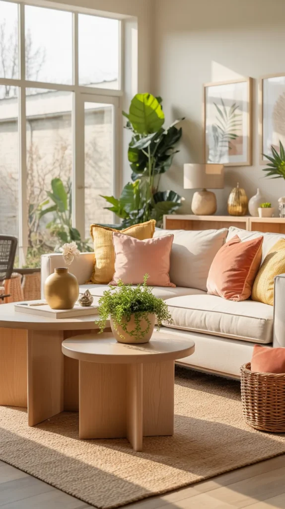
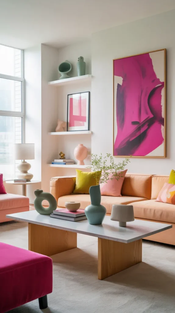
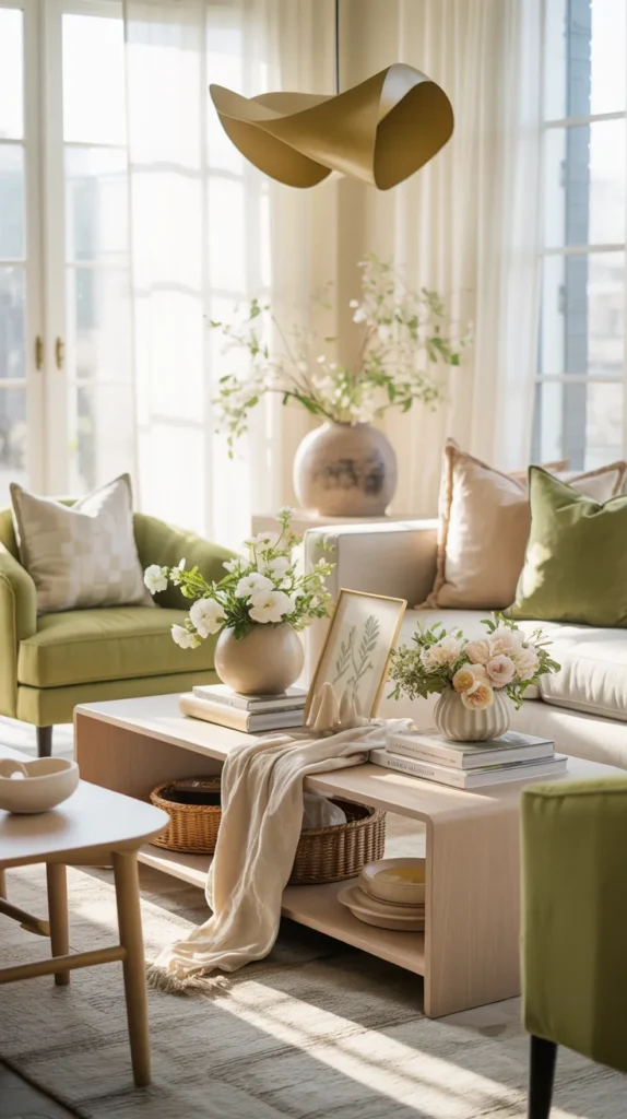
1. Soft Lilac + Lemon Yellow + Mint + Blush Pink

If spring had a personality, this palette would be it. Soft lilac and mint create an airy, dreamy foundation, while lemon yellow brings that cheerful spark that feels like sunlight pouring through an open window. Blush pink softens everything, adding warmth without tipping the palette into overly sweet territory. Together, these shades feel playful, optimistic, and full of life—exactly what spring is all about.
The key to making this palette work is balance and restraint. Instead of using all four colors equally, let one or two take the lead and allow the others to support. For example, mint or lilac can anchor the space, while lemon yellow and blush appear in smaller accents like pillows, artwork, or décor pieces. This approach keeps the look light and joyful rather than overwhelming. It’s an ideal choice for spaces that need energy but still want to feel soft and inviting.
2. Periwinkle + Buttercream + Eucalyptus + Soft Taupe
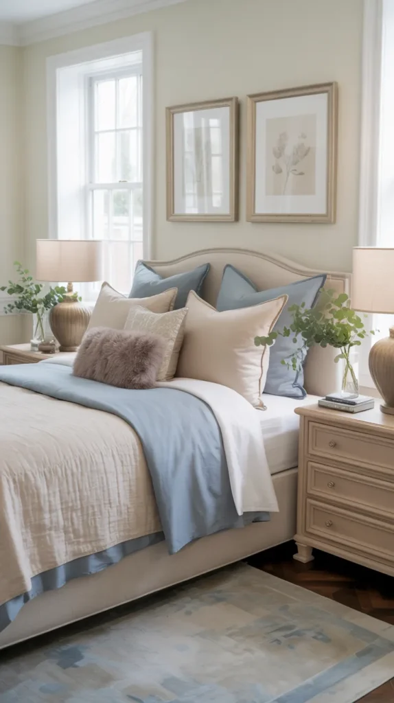
This palette feels like early morning—quiet, gentle, and refreshing. Periwinkle brings a cool, calming presence, while buttercream adds warmth that keeps the space from feeling too cool or sterile. Eucalyptus introduces a natural, botanical element, and soft taupe grounds everything, making the palette feel cozy rather than airy in a way that feels unfinished.
What makes this combination shine is how soothing yet layered it feels. It’s perfect for bedrooms, reading nooks, or living spaces where you want calm without boredom. Too much taupe can dull the look, so use it as a grounding neutral rather than the star. Adding texture—like linen, knits, or greenery—keeps the palette visually interesting. This is a spring color scheme for people who love softness but still want depth.
3 Grapefruit Pink + Tangerine + Lemon Zest + Pale Aqua
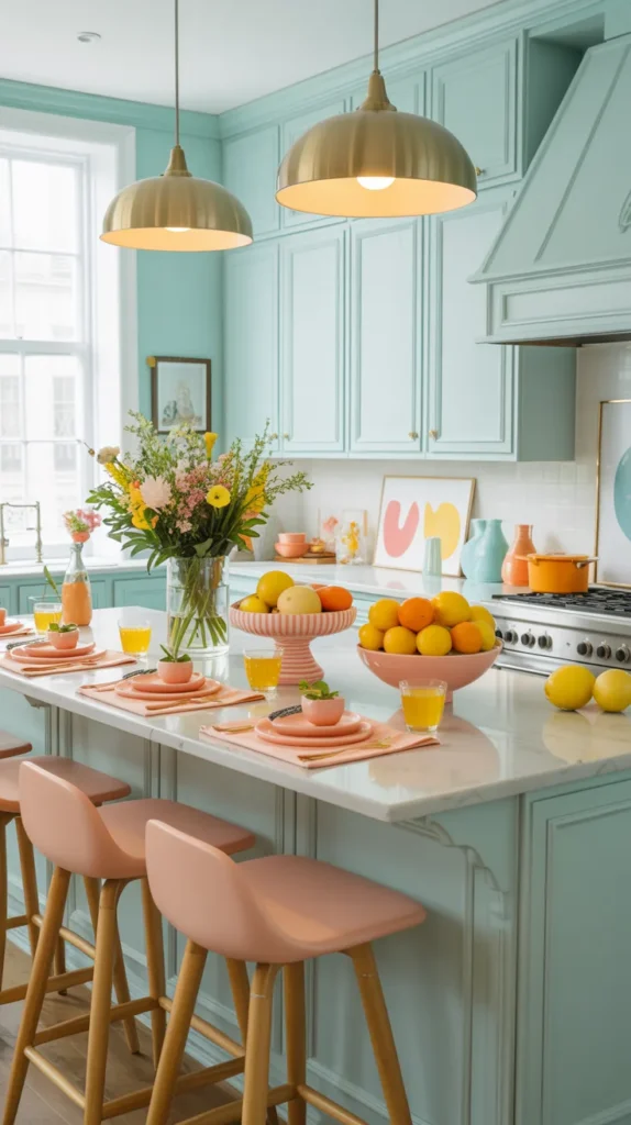
This palette is pure spring energy. Grapefruit pink, tangerine, and lemon zest instantly brighten any space, creating a bold, cheerful mood that feels playful and modern. Pale aqua steps in as the calming force, cooling the warmth of the citrus tones so the palette stays refreshing instead of chaotic. The result is lively, confident, and full of personality.
To make this color combination work in real life, think accents, not saturation. Citrus shades are powerful, so they’re best used in smaller doses—artwork, vases, cushions, or kitchen accessories—while pale aqua anchors the space through walls, textiles, or larger décor items. This palette is ideal for kitchens, creative studios, or entertaining areas where you want the space to feel energetic and social without becoming visually overwhelming.
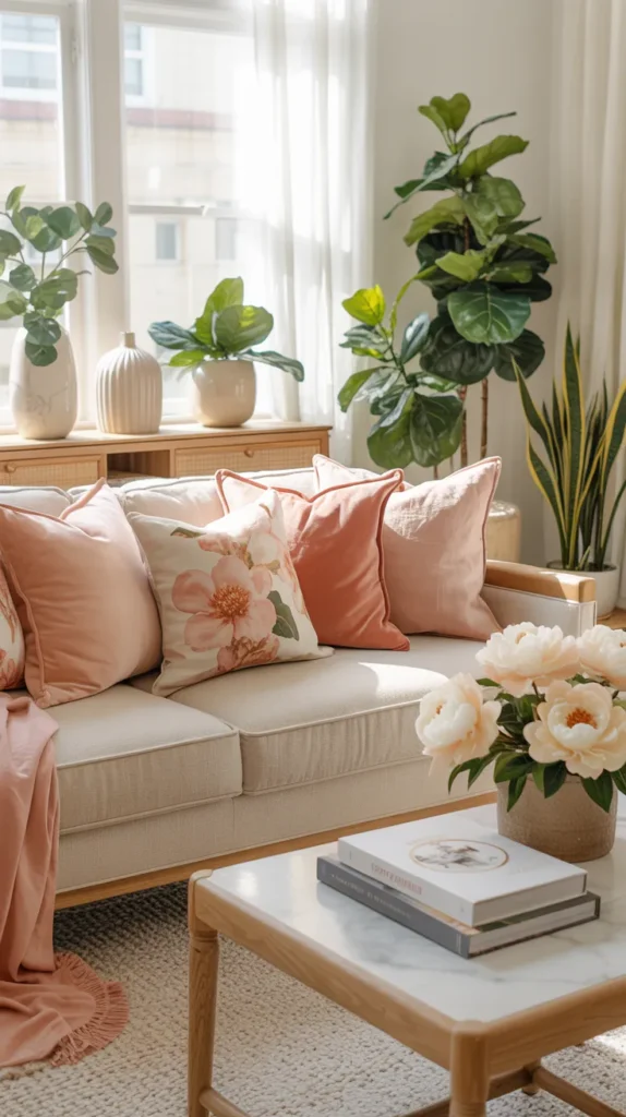
4. Blush Pink + Ivory + Eucalyptus + Dove Grey

This palette is proof that spring colors don’t have to be loud to feel fresh. Blush pink and ivory create a soft, romantic base, while eucalyptus brings in a natural, earthy element that keeps the look grounded. Dove grey adds structure and sophistication, preventing the palette from feeling too delicate or washed out.
What makes this combination timeless is its versatility and elegance. It works beautifully in living rooms, bedrooms, or even dining spaces, adapting easily to both modern and classic styles. The key is layering—mixing matte and soft textures, adding greenery, and incorporating subtle contrast through grey accents. This palette feels calm, polished, and effortlessly spring-ready, making it ideal for anyone who wants seasonal freshness without committing to bold color changes.
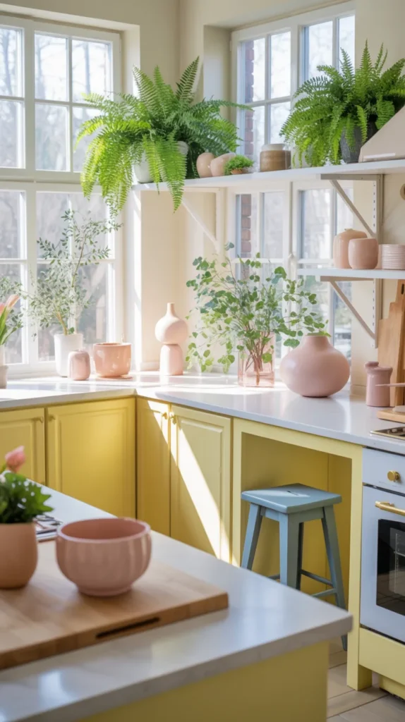
5. Fresh Sage + Warm White + Soft Butter Yellow

This palette feels like spring easing gently into your home rather than barging in. Fresh sage green sets a calm, grounding foundation, bringing in that quiet connection to nature that instantly makes a space feel more relaxed. Warm white keeps everything bright and clean without feeling stark, while soft butter yellow adds just enough sunshine to lift the mood. Together, these colors feel optimistic but restrained—perfect for anyone who wants a spring refresh that still feels grown-up and timeless.
What makes this palette especially appealing is how effortless and livable it feels. Sage works beautifully in larger elements like accent walls, cabinetry, or upholstery, while warm white anchors the space through walls, sofas, or bedding. Butter yellow shines best as a supporting player—think throw pillows, ceramic vases, artwork, or fresh florals—adding warmth without overpowering the room. The result is a space that feels light, welcoming, and thoughtfully styled, ideal for living rooms, kitchens, or bedrooms that need a subtle seasonal lift without committing to bold color changes.
6. Dusty Rose + Creamy Peach + Minty Teal
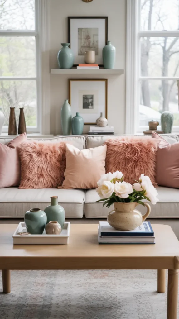
This palette feels soft, romantic, and quietly confident. Dusty rose and creamy peach bring warmth and elegance, while minty teal adds just enough contrast to keep the look feeling fresh and modern. Together, these colors strike a beautiful balance between nostalgic charm and contemporary style, making them perfect for spring spaces that want color without bold intensity.
What really elevates this palette is how luxurious it feels when layered thoughtfully. Use dusty rose in textiles like pillows or throws, let creamy peach appear in upholstery or accent decor, and bring in minty teal through artwork or ceramics. Adding natural materials—like light wood, linen, or stone—keeps the space from feeling overly sweet. This palette works especially well in living rooms, bedrooms, or cozy sitting areas where comfort and polish matter equally.
7. Powder Blue + Pastel Yellow + Cotton Candy Pink + Lavender
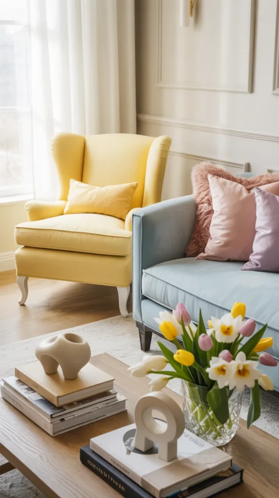
This palette feels joyful and playful, yet surprisingly sophisticated when styled correctly. Powder blue and lavender create a calm, airy foundation, while pastel yellow and cotton candy pink bring a gentle brightness that feels unmistakably spring. Instead of feeling childish, these hues can feel elevated when paired with the right textures and neutrals.
The secret here is using color with intention. Let powder blue or lavender anchor the room through larger elements like rugs, curtains, or bedding, then layer pastel yellow and pink through accents. Keeping walls, floors, or major furniture neutral allows the colors to shine without overwhelming the space. This palette is ideal for spaces that crave light and personality—think guest rooms, breakfast nooks, or creative corners.
8. Buttery Gold + Coral Blush + Mossy Green
Warm, uplifting, and grounded, this palette feels like early spring sunlight filtering through greenery. Buttery gold brings brightness and warmth, coral blush adds a soft pop of color, and mossy green keeps everything rooted and natural. It’s cheerful without being loud and feels especially inviting in shared living spaces.
This combination works best when gold and coral are used as accents, not dominant shades. Mossy green can take the lead through plants, upholstery, or rugs, while coral and gold appear in pillows, artwork, or decorative accessories. The result is a space that feels lively yet composed—perfect for living rooms, kitchens, or dining areas that benefit from warmth and energy without chaos.
9. Blush Pink + Ivory + Eucalyptus + Dove Grey
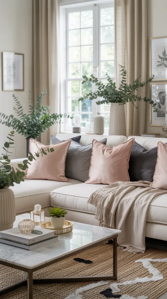
Timeless and refined, this palette proves that spring color doesn’t have to be bold to feel fresh. Blush pink and ivory create softness and warmth, eucalyptus introduces a natural, calming element, and dove grey adds structure and sophistication. The overall effect is balanced, elegant, and incredibly versatile.
What makes this palette stand out is its layered neutrality. Each color supports the others without overpowering the space. Use ivory as your base, blush pink sparingly for warmth, eucalyptus through greenery or subtle decor, and dove grey for contrast in furniture or accents. This palette is ideal for those who want a spring refresh that still feels polished, classic, and easy to live with year-round.
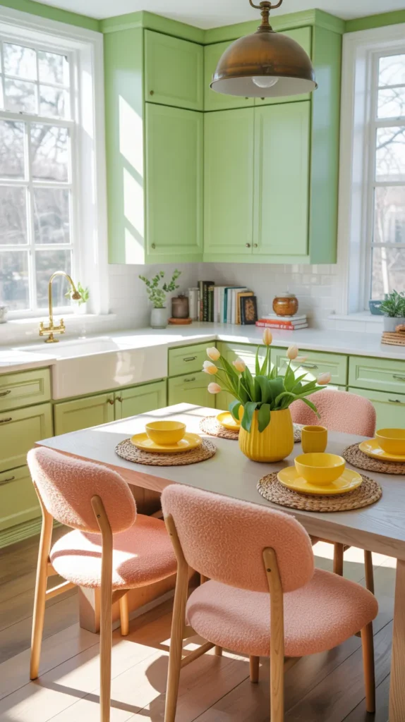
10. Pale Yellow + Rose Quartz + Fern Green + Robin Blue
Fresh, floral, and full of life, this palette feels like spring in full bloom. Pale yellow instantly brightens the space, rose quartz softens the look, fern green grounds it with nature-inspired depth, and robin blue adds a crisp, cheerful contrast. Together, these colors feel energetic yet balanced.
To keep this palette refined, let fern green do the heavy lifting through larger elements like rugs, furniture, or plants. Use pale yellow, rose quartz, and robin blue as accent colors in textiles, decor, or artwork. This approach prevents the palette from feeling overly sweet while still capturing that fresh, optimistic spring mood. It’s a great option for kitchens, sunrooms, or any space that benefits from natural light and color.
12. Misty Blue + Pale Grey + Chartreuse + Petal Pink

This palette feels clean, modern, and quietly playful. Misty blue and pale grey create a calm, airy foundation, while chartreuse injects energy and petal pink adds softness. The contrast between cool neutrals and unexpected pops of color makes this palette feel fresh and contemporary—perfect for spring without leaning overly pastel.
The key to making this palette work is restraint with chartreuse. Use it intentionally through small accents like pillows, artwork, or decorative objects so it energizes the space without overwhelming it. Misty blue and pale grey should take the lead through walls, upholstery, or rugs, while petal pink softens the overall look. This palette is ideal for modern living rooms, home offices, or creative spaces where you want a refined yet youthful spring update.
13. Peach Fuzz + Pistachio Green + Crisp White + Sunflower Yellow
Warm, playful, and uplifting, this palette feels like sunshine bottled into color form. Peach fuzz adds softness and warmth, pistachio green brings a fresh, earthy balance, and crisp white keeps the palette clean and breathable. Sunflower yellow appears as a joyful accent, adding energy without overpowering the space.
This combination shines when yellow is used sparingly. Let pistachio green and peach fuzz anchor the room through textiles, furniture, or decor, while sunflower yellow pops up in accessories like cushions, vases, or artwork. Crisp white provides breathing room, preventing the palette from feeling busy. This color scheme works beautifully in kitchens, breakfast nooks, or casual living spaces where warmth and light are key.
14. Electric Magenta + Aqua + Chartreuse + Peach
Bold, expressive, and unapologetically modern, this palette is for those who want spring color to make a statement. Electric magenta and chartreuse bring high energy, aqua cools the palette down, and peach softens the intensity, creating a look that feels artistic rather than chaotic.
To keep this palette refined, peach should act as the grounding shade. Use it as a backdrop through walls, upholstery, or larger decor pieces, then layer in magenta, aqua, and chartreuse through art, accessories, or textiles. This palette works especially well in creative spaces, statement living rooms, or styled corners where personality is the goal. When balanced thoughtfully, it feels bold yet curated—never overwhelming.
15. Burnt Orange + Violet + Olive Green + Buttercup Yellow
Earthy yet vibrant, this palette feels inspired by wildflower fields in full bloom. Burnt orange and olive green create depth and warmth, violet adds richness, and buttercup yellow brings a cheerful spark that keeps the palette feeling spring-appropriate rather than heavy.
The secret to using this palette successfully is choosing one dominant color and letting the others support it. Olive green works beautifully as a base through rugs, furniture, or greenery, while burnt orange and violet add drama in smaller doses. Buttercup yellow should appear sparingly for brightness. This palette is ideal for living rooms or dining spaces that want warmth, character, and a strong seasonal personality without sacrificing sophistication.
16.Bold Coral + Teal +blush pink
This vibrant pairing instantly energizes a space while still feeling polished and intentional. Coral brings warmth and optimism, making it perfect for spring, while teal adds contrast and depth without tipping into heaviness. Together, they strike a beautiful balance between playful and refined—ideal for spaces that need personality without feeling overwhelming. When coral is used on walls or larger furniture pieces and teal appears through accents like cushions, artwork, or ceramics, the palette feels lively yet controlled.
What keeps this color combination feeling elevated is simplicity in styling. Clean-lined furniture, light wood tones, and minimal decor allow the colors to shine without visual clutter. Fresh florals, framed art, and a few thoughtfully placed accessories reinforce the spring mood without distracting from the palette itself. This combination works especially well in home offices, reading nooks, or small living areas where a pop of color can completely transform the feel of the room.
17. Peach Blossom + Soft Coral + Eucalyptus Green
This palette feels warm, fresh, and gently romantic without leaning overly sweet. Peach blossom and soft coral bring a subtle glow that instantly softens a space, while eucalyptus green grounds the palette with a calm, natural presence. Together, these colors create a spring look that feels welcoming and lived-in, like sunlight filtering through greenery on a warm morning.
What makes this combination especially appealing is its effortless balance between warmth and freshness. Peach and coral work best in textiles—pillows, throws, upholstery, or artwork—while eucalyptus green shines through plants, accent chairs, or decorative ceramics. Keeping the base neutral allows these colors to layer beautifully without overwhelming the room. This palette works especially well in living rooms, bedrooms, or open-plan spaces where you want spring warmth with a refined, botanical touch.
18. Pistachio Green + Warm Beige + Gold Accents
Fresh yet refined, this palette feels quietly luxurious. Pistachio green brings a clean, uplifting energy, warm beige softens and grounds the space, and gold accents add just the right amount of polish. The result is a spring color palette that feels elevated and intentional without being flashy—perfect for an upper-middle-class home that values subtle elegance.
The key here is letting pistachio green be the star without overpowering the space. Use it through cabinetry, accent furniture, or textiles, while warm beige anchors larger surfaces like walls, rugs, or sofas. Gold works best when used sparingly—through lighting, hardware, mirrors, or decorative objects—so it enhances rather than dominates. This palette is ideal for kitchens, dining spaces, or living rooms that need a fresh spring update with a slightly luxe finish.
19. Buttercream Yellow + Soft Taupe + Muted Lavender
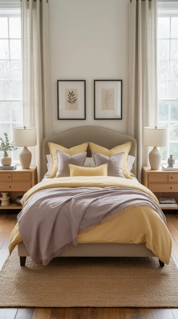
This palette is soft, cozy, and unexpectedly versatile. Buttercream yellow adds warmth and brightness without feeling loud, soft taupe keeps the look grounded and calming, and muted lavender introduces a gentle hint of color that feels modern rather than traditional. Together, these tones create a spring atmosphere that feels comforting, polished, and easy to live with.
To keep this palette refined, use buttercream as an accent rather than a base. Taupe works beautifully on larger furniture pieces or walls, while lavender appears through pillows, artwork, or decorative accessories. Layering textures—linen, knits, ceramics—helps the colors feel rich and intentional. This palette works especially well in bedrooms, reading nooks, or living spaces where you want spring softness without sacrificing sophistication.
20. Pale Aqua + Driftwood Brown + Soft White
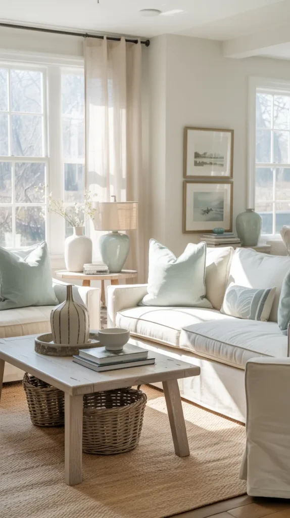
Relaxed, airy, and timeless, this palette feels inspired by nature without leaning coastal or themed. Pale aqua brings freshness and light, driftwood brown adds warmth and depth, and soft white keeps everything clean and breathable. The combination feels calm and grounded—perfect for spring refreshes that still feel classic and versatile.
What elevates this palette is its natural, layered look. Pale aqua works best in subtle doses through decor, textiles, or accent furniture, while driftwood brown anchors the space through wood furniture, baskets, or flooring. Soft white ties everything together, allowing the colors to shine without visual clutter. This palette is ideal for living rooms, bathrooms, or open spaces where you want a serene, upper-middle-class spring aesthetic that feels effortlessly put together.