The Cozy Color Combo Designers Are Using for Fall 2025
Why Everyone’s Talking About This Fall’s Palette
Okay, real talk: fall is the Beyoncé of seasons when it comes to home decor. Everything suddenly feels more elevated, more cozy, more… intentional. And 2025? Designers have decided we’re not just sprinkling in pumpkins and calling it a day. Nope. This year, it’s all about one knockout color combo that’s showing up everywhere—from high-end interiors to viral Pinterest boards.
And trust me, once you see it, you’ll be like, why didn’t I think of that first?
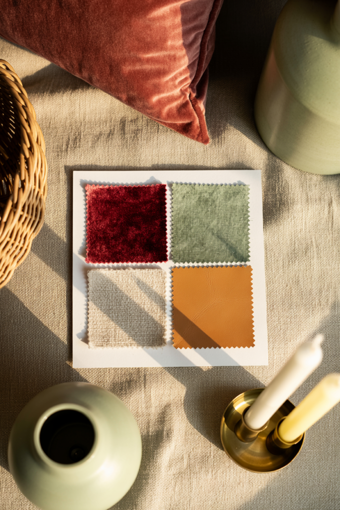
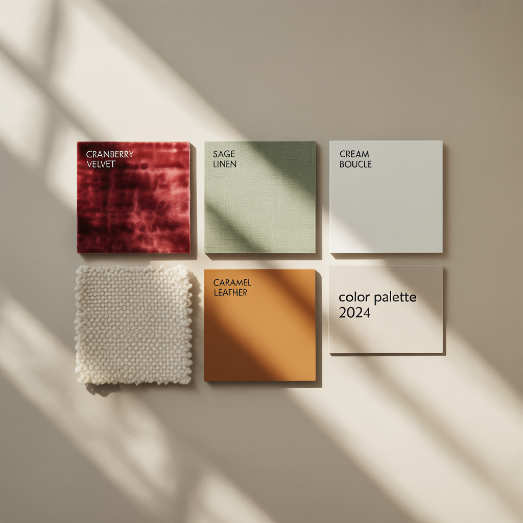
Spoiler: it’s not the typical orange-brown situation your grandma had in 1998. We’re talking about a fresh, luxe mix of deep cranberry red and soft sage green, layered with warm neutrals like cream and caramel. Sounds dreamy, right? Let’s break down why this combo is having a moment and how you can actually pull it off without making your living room look like a Christmas ad in October.
Why This Color Combo Works So Well
You know when you put on an outfit and suddenly feel like a million bucks? That’s basically what cranberry + sage + warm neutrals are doing for homes this fall.
Here’s the magic formula:
- Cranberry Red = Depth + Drama
- Sage Green = Calm + Freshness
- Cream + Caramel = Balance + Warmth
Together, they give you that “I hired a designer” look without the actual designer bill (win-win).
Why does it feel so cozy? Because cranberry brings the richness of fall, sage keeps things grounded and earthy, and the warm neutrals stop the whole thing from feeling overwhelming. It’s like putting whipped cream on top of your pumpkin pie—it just ties everything together.
Ever noticed how some color combos feel like they’re shouting at you? This one whispers, “come curl up with a blanket.” 🙂
How Designers Are Using It
Living Rooms That Feel Luxe (Without Trying Too Hard)
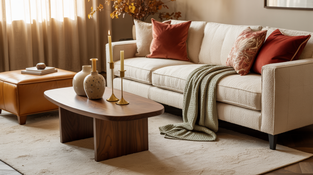
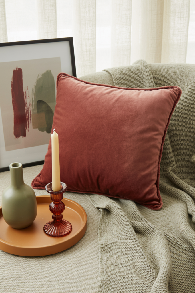
Designers are throwing cranberry onto accent chairs, velvet throw pillows, or even a chunky knit blanket draped over the couch. Then they balance it with sage in subtle ways—like a ceramic vase, woven throw, or even wall art with botanical tones.
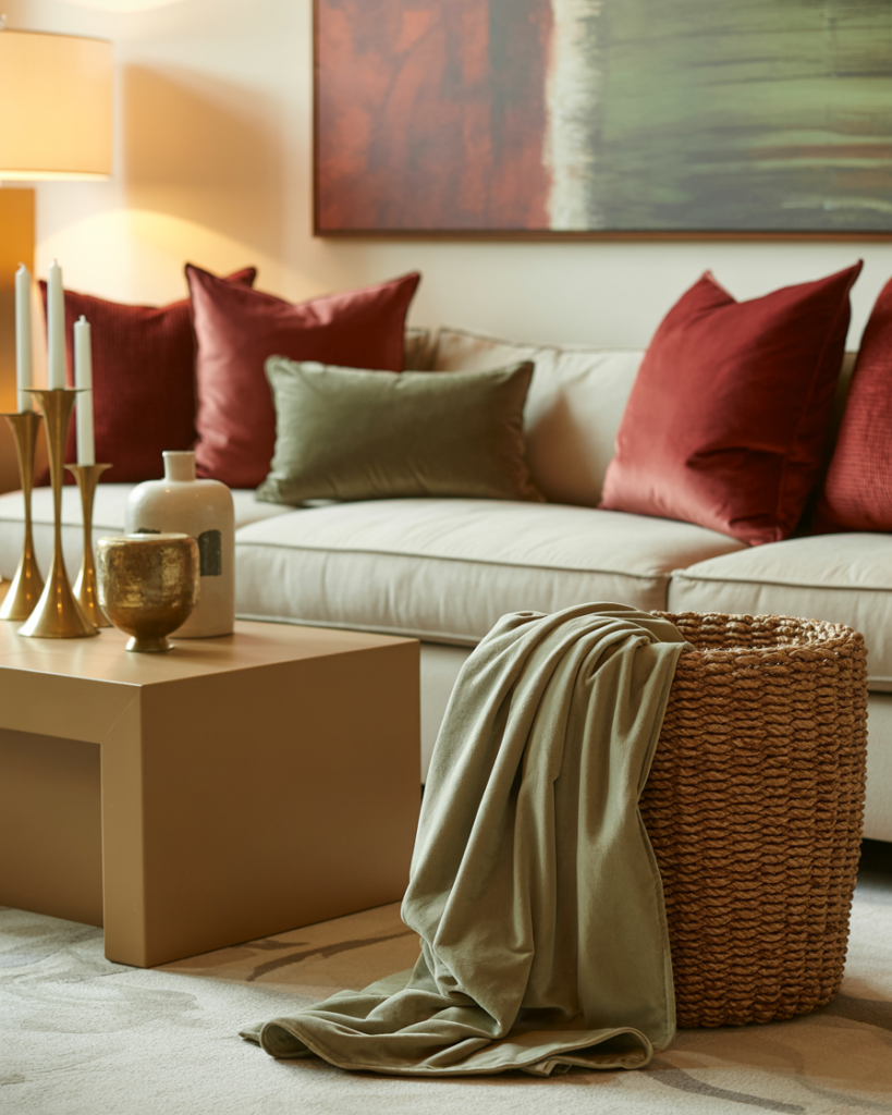
The trick? Keep your base neutral. Think creamy beige sofas, caramel wood tones, or light walls. Then let cranberry and sage take turns being the star.
Bedrooms That Actually Make You Want to Sleep In
Instead of the standard gray or beige bedding (yawn), designers are layering cranberry duvets with sage pillow shams and cream sheets. Add a caramel-toned headboard, and suddenly your bedroom feels like a luxury hotel in Vermont.
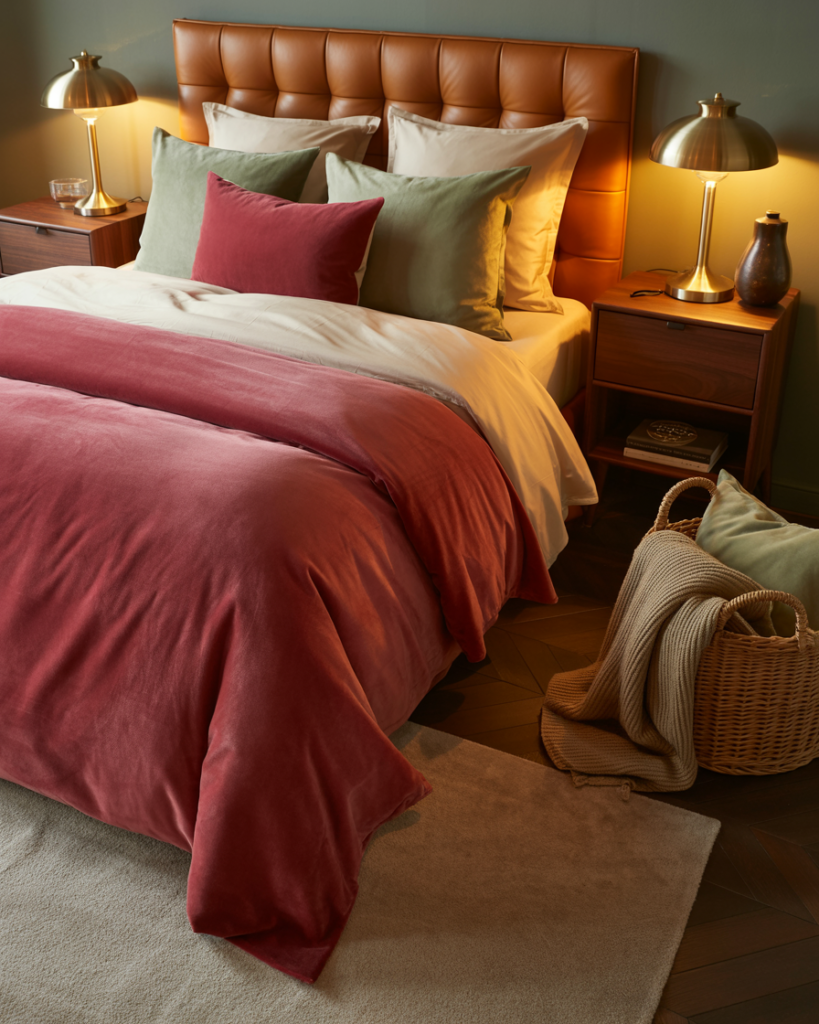
Pro tip: if you’re nervous about cranberry being “too much,” start small with a throw blanket. You’ll thank me later.
Dining Rooms That Scream Fall Dinner Party
Imagine a long wooden table set with sage napkins, cranberry taper candles, and cream plates with caramel chargers. Even if you’re just serving frozen pizza, it’ll feel like you’re hosting a Michelin-star dinner.

Ways to Use the Combo Without Redecorating Your Whole House
Not ready to repaint walls or drop $2K on furniture? No worries—you can still nail this color story.
Here are some quick (and budget-friendly) swaps:
- Throw Pillows – Always the easiest hack. Cranberry velvet + sage linen = chef’s kiss.
- Blankets – Layer a chunky cranberry knit with a sage wool throw at the foot of your bed or couch.
- Rugs – A neutral base rug with tiny cranberry or sage accents keeps things grounded.
- Candles & Vases – Swap out summer brights for cranberry glass or sage ceramic.
- Art Prints – Even one cranberry + sage abstract print can transform a plain wall.
Honestly, sometimes just changing your candles makes a bigger vibe shift than buying a whole new sofa. (Ask me how I know…)
How to Avoid the “Holiday Decor” Trap
I know what you’re thinking: cranberry + green = Christmas, right? But hear me out—sage isn’t the same as pine green.That’s what keeps this combo chic instead of Santa.
Tips to Keep It Fall, Not Festive:
- Use muted tones (dusty cranberry and earthy sage) instead of bold red + emerald.
- Anchor the palette with caramel and cream neutrals.
- Avoid sparkly accents—stick with matte, textured finishes like linen, velvet, or stoneware.

Basically, the goal is “designer cozy,” not “North Pole chic.”
Pairing This Palette with Other Fall 2025 Trends
Designers aren’t just using cranberry and sage in a vacuum—they’re layering them with other big vibes of the season. Here’s how it all connects:
- Chunky Textures: Think oversized knits, boucle chairs, and woven baskets. These textures love warm, earthy tones.
- Organic Shapes: Curved lamps, round mirrors, and blob-shaped coffee tables work perfectly with this softer palette.
- Vintage Vibes: Brass candlesticks, ceramic vases, and rustic wood? Yes please. Cranberry and sage look extra rich against them.
- Layered Neutrals: Designers are mixing cream, taupe, and caramel under cranberry/sage accents. It’s like creating a fall latte for your living room.
My Personal Take (And Mini Rant)
IMO, this is the first fall color combo in years that doesn’t feel forced. Remember when everything was pumpkin spice orange? Cute for one week, annoying for three months. And don’t get me started on the 2020 all-gray interiors—if I wanted to live inside a cloud, I’d move to Seattle in November (and FYI, I live in Seattle, so yes, I’m allowed to say that).
Cranberry + sage + neutrals actually feel livable. It’s cozy without being corny. Stylish without being try-hard. And best of all, it works year-round if you tone it down after fall. Swap cranberry for blush in spring, or keep sage year-round for a calming vibe. That’s versatility, my friend.
Easy Color Pairing Formulas (Bookmark This!)
If you’re the type who likes formulas (same, honestly), here are a few quick-hit combos you can steal straight from designer mood boards:
- Cranberry + Sage + Cream = Cozy + Balanced
- Cranberry + Caramel + Taupe = Warm + Luxe
- Sage + Beige + Walnut Wood = Calm + Earthy
- Cranberry + Gold Accents + Ivory = Elegant + Glam
Where to Shop for This Look (Without Selling a Kidney)
High-end designers make it look expensive, but you don’t need a $700 throw pillow.
- Amazon – Velvet cranberry pillow covers and sage throws under $30.
- Target – Always has seasonal home drops with these colors baked in.
- Etsy – Custom wall prints and ceramics in muted cranberry and sage.
- Thrift Stores – Seriously, vintage cranberry glassware is everywhere right now.
Designers love to mix high + low, so don’t feel weird about pairing a $20 throw with a $400 rug. The mix actually makes it look intentional.
Final Tips for Styling Like a Pro
- Layer Textures, Not Just Colors. A cranberry velvet pillow looks way better next to a sage linen one than if everything’s the same fabric.
- Play with Scale. Mix one big cranberry accent chair with smaller sage accessories.
- Repeat Each Color at Least Twice. If cranberry shows up in your pillow, add it again in candles or art for balance.
- Add Metallics Sparingly. Warm gold or brass complements the palette perfectly. Just don’t go overboard unless you’re aiming for Versailles vibes.

Conclusion: Cozy Meets Chic
So there you have it: the cozy color combo designers can’t stop using for fall 2025. Cranberry red, sage green, and warm neutrals are basically the holy trinity of this season’s palette.
Want your space to feel expensive but still inviting? This combo nails it. Want to avoid the “Christmas in October” vibe? Stick to muted shades and matte textures. Want a look that feels cozy but not cliché? This is your answer.
Honestly, I’m already eyeing a cranberry velvet pillow for my couch—and maybe a sage vase for balance. Because if my living room doesn’t scream cozy designer vibes this fall, did I even try? 😉