Warm Color Palettes That Make Your Home Feel Expensive & Inviting
Warm color palettes have a way of making a home feel instantly more inviting. They soften harsh lines, add depth to a space, and create that cozy, lived-in feeling people are naturally drawn to. Whether it’s creamy beiges, sun-washed terracotta, soft blush, or rich caramel tones, warm hues bring a sense of comfort and quiet luxury that cool colors simply can’t replicate. They make rooms feel brighter without being stark and more intimate without feeling heavy.
Designers love warm palettes because they work in almost every style — modern, boho, traditional, or minimal — and they photograph beautifully in natural light. A warm-toned room feels welcoming the moment you walk in, making it perfect for living spaces, bedrooms, and anywhere you want to relax and unwind. In this guide, we’re breaking down the prettiest warm color palettes that instantly elevate a home, showing you how to use them in real spaces so your rooms feel cozy, stylish, and effortlessly pulled together.
1. Terracotta and Cream

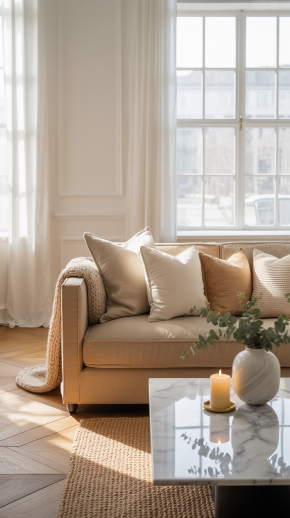
Terracotta and cream is one of those color combinations that instantly makes a space feel warm, grounded, and effortlessly beautiful. Terracotta carries the feeling of sun-baked clay, Mediterranean villas, and earthy elegance, while cream softens everything with a light, airy glow. When used together, these colors create rooms that feel both cozy and elevated — never heavy, never cold. It’s a palette that makes a living room or dining area feel welcoming the moment you step inside, like the space is gently wrapping itself around you.
In a home styled with this palette, terracotta often shows up in accent walls, pottery, throw pillows, or patterned rugs, while cream anchors the larger elements like walls, sofas, and curtains. The contrast between the warm clay tones and the soft neutral base creates visual depth without overwhelming the room. Add natural wood furniture, linen textiles, and greenery, and the space takes on a relaxed, European warmth that feels curated but not staged — the kind of home people instantly feel comfortable in.
2. Honey Beige and Soft White
Honey beige and soft white create a glow that makes a home feel bright, calm, and quietly luxurious. This palette is perfect for anyone who loves neutral interiors but doesn’t want them to feel flat or sterile. The honey tones add just enough warmth to keep the space from feeling cold, while soft white keeps everything light and breathable. Together, they create rooms that feel fresh, peaceful, and beautifully balanced.
In a bedroom or living room, honey beige shows up beautifully in upholstered furniture, rugs, and curtains, while soft white keeps walls and bedding feeling crisp and open. The warmth comes from subtle golden undertones rather than bold color, which makes the space feel timeless and expensive. Sunlight reflects gently off the light surfaces, giving the room a soft glow throughout the day. This palette is especially powerful in homes that want a calm, minimalist look without losing warmth and personality.
3. Rust and Warm Taupe

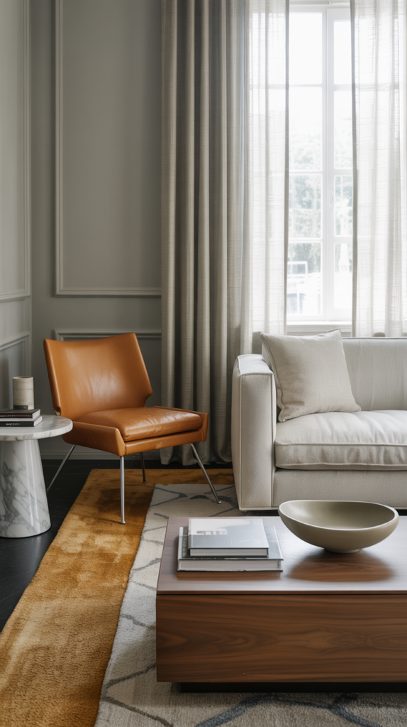
Rust and warm taupe is a richer, more modern way to bring warmth into your home. Rust adds depth, character, and a sense of lived-in elegance, while taupe keeps the space grounded and sophisticated. This palette is ideal for living rooms, offices, and bedrooms where you want warmth without sacrificing a clean, contemporary feel.
Rust works beautifully as an accent color — in chairs, pillows, rugs, or artwork — bringing visual interest and warmth to the room. Warm taupe walls and furniture create a neutral base that allows those richer tones to stand out without overwhelming the space. The result is a room that feels layered, cozy, and stylish, with a subtle sense of drama that still feels relaxing and livable. It’s the kind of palette that makes a space feel thoughtfully designed rather than simply decorated.
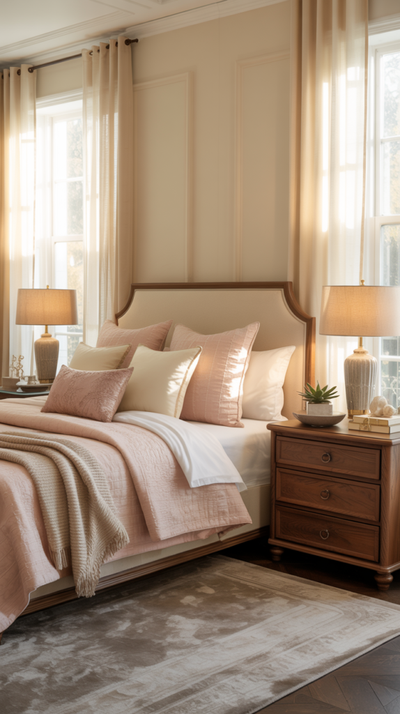
4. Clay Pink and Mocha

Clay pink and mocha create a soft, romantic warmth that feels grown-up and refined. Unlike bright pinks, clay pink has a muted, earthy quality that blends beautifully with deeper mocha tones. This combination makes rooms feel comforting, intimate, and quietly luxurious — perfect for bedrooms, reading nooks, and sitting areas.
Clay pink adds softness and light, while mocha grounds the space with richness and depth. Together, they create a layered look that feels both cozy and elegant. Think blush bedding, warm wood furniture, dark accent pillows, and soft neutral curtains filtering in daylight. This palette creates a calming environment that feels emotionally soothing — the kind of space that invites you to slow down, unwind, and stay a while.
5. Buttery Yellow and Linen
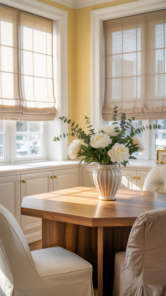
Buttery yellow and linen bring a cheerful, sun-filled warmth into a home without feeling loud or overwhelming. This palette feels like natural light in color form — soft, uplifting, and welcoming. It works especially well in kitchens, breakfast nooks, and living areas where you want the space to feel open, happy, and full of life.
The yellow adds warmth and energy, while linen tones keep everything grounded and airy. Together, they create spaces that feel bright but still cozy, fresh but still relaxed. Wood furniture, neutral upholstery, and soft textiles complete the look, making the room feel lived-in and inviting. It’s a palette that makes everyday moments — morning coffee, family meals, quiet afternoons — feel just a little more beautiful.
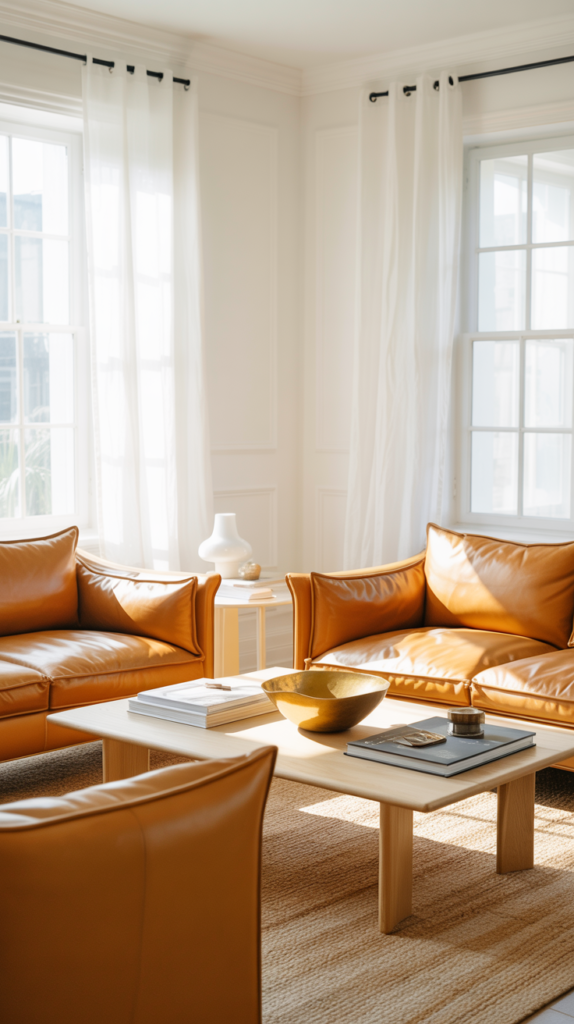
6. Caramel and Warm Gray
Caramel and warm gray is the palette for someone who wants their home to feel modern and polished, but still deeply cozy. Caramel brings that rich, golden-brown warmth that feels expensive and comforting at the same time — like a high-end leather chair, a perfectly toasted wood tone, or a warm latte in a beautiful ceramic mug. Warm gray balances it out by keeping the space calm and sophisticated, so the room doesn’t swing too orange or overly “rustic.” This combination looks especially refined in living rooms and open-concept spaces because it creates contrast without harshness, and it photographs beautifully in natural daylight.
To make this palette feel upper-middle-class, focus on quality textures and intentional layering. Think warm gray walls in a soft matte finish, a caramel leather accent chair or caramel velvet pillows, and a substantial wool rug that grounds the room. Add a stone or marble coffee table, warm-toned oak floors, and brushed brass accents for a subtle glow. The overall effect should feel collected and tailored — not trendy — like a home that was designed thoughtfully and will still look timeless years from now.
7. Cinnamon and Oatmeal

Cinnamon and oatmeal is warm, soft, and unbelievably livable — the kind of palette that makes a room feel like it’s always ready for a slow morning or a quiet evening. Cinnamon has a gentle spice to it that adds depth and richness, while oatmeal brings a creamy, calming base that keeps everything bright and airy. This pairing works beautifully in bedrooms, family rooms, and cozy nooks because it creates warmth without creating visual clutter. It feels elevated in the way expensive neutrals do: subtle, layered, and comforting, rather than loud or overly styled.
What makes this palette feel high-end is how it leans into texture. Oatmeal linen curtains, a plush upholstered bed in a warm neutral, and a thick woven rug instantly create softness. Cinnamon can come in through a patterned rug detail, velvet pillows, warm-toned artwork, or an accent chair in a refined, muted spice shade. Keep the styling calm and cohesive — warm wood furniture, ceramic lamps, and a few curated accessories — so the room looks intentional and serene, like a boutique hotel suite designed for real life.
8. Peach and Sand

Peach and sand is the palette equivalent of golden-hour light — soft, flattering, and quietly luxurious. Peach adds warmth and a subtle glow that feels fresh and welcoming, while sand tones keep the space grounded and sophisticated. This isn’t a bright, sugary peach; it’s a muted, sun-washed peach that feels mature and elegant, especially when paired with creamy beige, warm whites, and natural textures. This palette is perfect for guest rooms, nurseries, bathrooms, or light-filled living spaces where you want warmth that still feels airy and calm.
To make peach and sand feel upper-middle-class (not juvenile), treat peach like a refined accent rather than the whole story. Use sand as your foundation — walls, rugs, large furniture — then bring peach in through art, pillows, a throw blanket, or a subtle upholstered bench. Add warm wood, soft brass accents, and textural pieces like linen curtains or a woven pendant light. Done well, this palette makes a space feel “pretty” in a grown-up way — soft, welcoming, and beautifully put together without trying too hard.
9. Brick Red and Warm Ivory

Brick red and warm ivory is timeless, bold, and extremely elegant when styled with restraint. Brick red brings depth and character — it’s richer than terracotta and more grounded than a true red — while warm ivory keeps the palette soft and sophisticated. This combination feels classic and upscale, especially in dining rooms, libraries, entryways, or living rooms where you want the space to feel memorable. It has that “heritage home” warmth without looking dated, especially when paired with clean lines and modern finishes.
The key to keeping brick red from overpowering the room is balance and placement. In an upper-middle-class space, brick red might show up as a velvet accent chair, a statement rug, a large piece of art, or even a painted built-in — while ivory carries the walls, curtains, and larger upholstery. Add dark wood or warm oak, a few black accents for definition, and brass or aged gold for glow. The result is a room that feels rich, inviting, and intentional — like it has a point of view, not just a color scheme.
10. Mocha and Cream

Mocha and cream is one of the most effortlessly luxurious warm palettes because it looks expensive without needing bold color. Mocha brings depth, richness, and that cozy café warmth, while cream keeps the space bright, soft, and airy. This palette works almost anywhere — living rooms, bedrooms, home offices — because it feels calm and elevated, but still warm enough to be welcoming. It’s especially perfect if you love neutrals but want a space that feels layered and designer, not flat or “all beige.”
To nail this palette in an upper-middle-class way, lean into contrast and material quality. Cream walls and curtains make the room glow, while mocha comes in through wood tones, upholstered chairs, pillows, or a deep-toned rug. A cream sofa paired with mocha leather accents or dark wood side tables instantly looks curated. Add texture through boucle, linen, wool, and ceramic, and keep decor minimal but beautiful — a sculptural lamp, a large framed print, a few stacked books. The room should feel like calm luxury: simple, warm, and quietly impressive.
11. Warm Olive and Beige
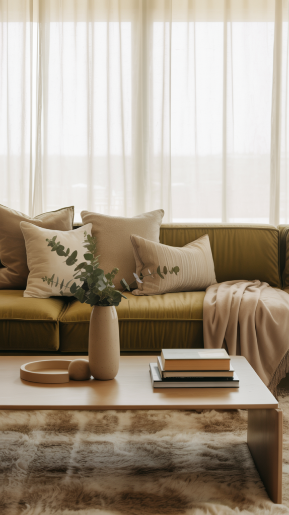
Warm olive and beige creates a palette that feels grounded, calming, and quietly luxurious. Olive brings a natural depth that instantly makes a space feel more sophisticated, while beige softens the look and keeps everything light and livable. This combination works especially well in living rooms and bedrooms where you want the space to feel peaceful but still layered and interesting. It has a subtle, organic elegance that feels inspired by nature without being rustic.
In an upper-middle-class home, warm olive might appear on an accent wall, a velvet sofa, or statement curtains, while beige keeps the larger surfaces relaxed and bright. Soft wood furniture, woven textures, and touches of brass or stone elevate the palette even further. The result is a room that feels intentional, warm, and refined — the kind of space that feels both stylish and deeply comfortable, perfect for everyday living and entertaining.
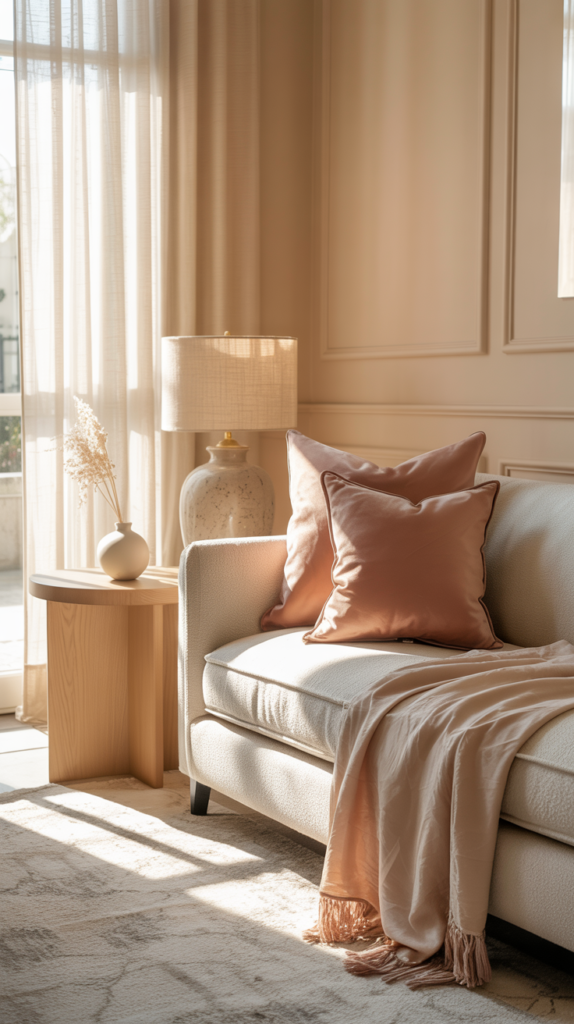
12. Mocha and Blush
Mocha and blush strike a beautiful balance between richness and softness. Mocha adds warmth and depth, while blush introduces a gentle, romantic glow that keeps the room from feeling heavy. This palette feels especially luxurious in bedrooms and sitting rooms, where the mix of soft color and warm neutrals creates an atmosphere that feels calm, inviting, and emotionally comforting.
Blush works best when used in subtle, layered ways — pillows, bedding, artwork, or a softly upholstered chair — while mocha grounds the space through wood furniture, rugs, or darker textiles. When paired with cream walls and natural light, this combination feels elevated and elegant rather than trendy. It’s the kind of palette that makes a room feel warm and beautiful without ever feeling overstated.
13. Golden Tan and White
Golden tan and white is a warm, bright palette that makes a home feel open, fresh, and quietly upscale. Golden tan adds warmth and a hint of richness, while white keeps the space feeling clean and spacious. This pairing is perfect for living rooms, open-concept homes, and spaces where you want light to bounce around beautifully while still feeling cozy.
Golden tan looks stunning in leather furniture, wood tones, and woven textures, while white keeps walls, curtains, and larger pieces feeling airy. Add touches of brass, natural stone, and soft textiles to elevate the look. The result is a space that feels timeless, inviting, and effortlessly elegant — the kind of room that always feels well put together.
14. Copper and Cream
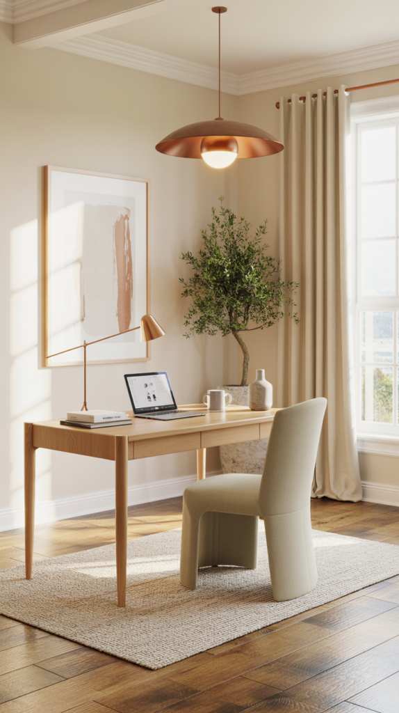
Copper and cream create a palette that feels warm, glowing, and distinctly luxurious. Copper adds a subtle shimmer and richness that instantly elevates a room, while cream keeps everything soft and balanced. This combination works beautifully in home offices, living rooms, and dining areas where you want a space to feel refined but still warm and welcoming.
In a well-designed home, copper might appear in lighting fixtures, decor accents, or framed artwork, while cream carries the walls, furniture, and textiles. When paired with warm wood and neutral fabrics, the copper tones add just the right amount of visual interest without overwhelming the space. The overall effect is elegant, cozy, and quietly impressive — perfect for homes that value understated luxury.
15. Dusty Rose and Warm Beige
Dusty rose and warm beige is soft, elegant, and incredibly comforting. Dusty rose adds a muted, romantic warmth, while beige keeps the palette grounded and timeless. This combination feels beautiful in bedrooms, reading nooks, and sitting areas where you want the space to feel soothing and stylish at the same time.
Dusty rose works best when used in subtle layers — throw pillows, blankets, or accent chairs — while beige forms the calm foundation through walls, rugs, and larger furniture. Paired with warm wood and natural textures, this palette creates a room that feels thoughtful and welcoming, with just enough color to feel special. It’s the kind of space that feels gentle, elevated, and deeply relaxing.