20 Modern Orange Living Rooms You’ll Want Immediately
For years, living rooms played it safe — beige sofas, gray rugs, and palettes designed to disappear rather than inspire. But lately, designers and homeowners are leaning into something much more expressive: orange. Not the heavy retro shades from decades past, but fresh, juicy tones that feel like sunlight inside a room. Think tangerine upholstery, coral accents, and citrus decor that instantly energizes a space instead of overwhelming it.
The beauty of orange is how adaptable it actually is. It can look modern and minimal next to white walls, glamorous paired with marble and brass, or relaxed in a breezy Mediterranean-style apartment. Whether you want one bold statement piece or just a few warm accents, decorating with orange adds personality without sacrificing sophistication. Below are 20 bright orange living room ideas that feel current, cheerful, and anything but dated.
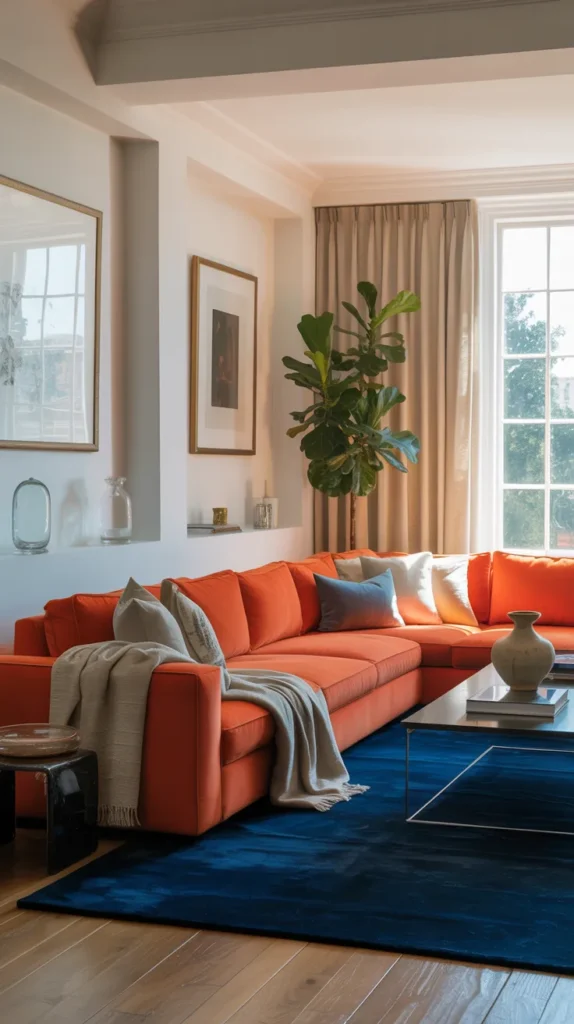
1. The orange Statement Sofa
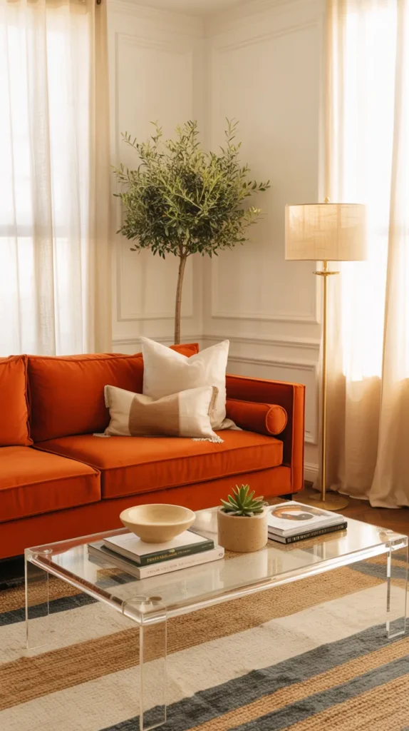
If you’re nervous about decorating with color, this is the easiest place to start — one bold piece, everything else calm. A bright orange sofa instantly becomes the personality of the room, so you don’t need busy decor fighting for attention. Keep the base clean: white or cream walls, a light neutral rug, maybe a glass or acrylic coffee table so the eye goes straight to the seating. The magic here is contrast — the room feels airy and minimal, but the sofa makes it memorable instead of forgettable. This is exactly why designers love statement furniture: it creates style without clutter.
To make it feel intentional (not random), repeat the color in tiny doses. Add one or two orange books, a small ceramic bowl, or subtle art that echoes the tone. Avoid matching everything — that’s how rooms start looking themed. Instead, think color conversation, not color coordination. The sofa speaks, and the rest of the room answers quietly. The result is a living room that feels confident and modern rather than loud, proving you don’t need a rainbow palette to make an impact.
2.Orange Throw Pillows
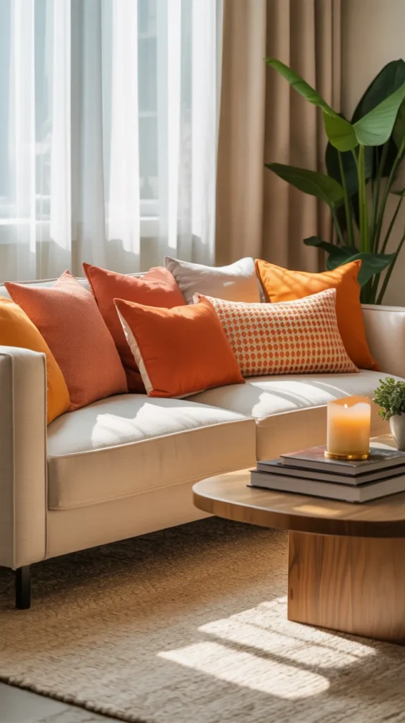
If painting walls or buying new furniture feels like too much, start with the smallest upgrade that makes the biggest visual difference: throw pillows. A neutral living room can look completely different just by introducing warm color at eye level. Orange works especially well because it instantly adds life to beige, white, gray, or cream sofas without overpowering them. Instead of replacing your base palette, you’re layering personality on top of it — which is why pillows are often the designer’s favorite styling tool.
The trick is variation, not matching. Combine different shades and textures — maybe a smooth cotton, a boucle, and a subtle pattern — so the arrangement feels collected rather than purchased as a set. Add one darker or lighter tone to create depth, and keep the number odd for a relaxed look. Suddenly the sofa feels styled instead of staged, and the room gains warmth without committing to permanent color. It’s proof that small changes often create the most noticeable impact.
3.Orange Gallery Wall
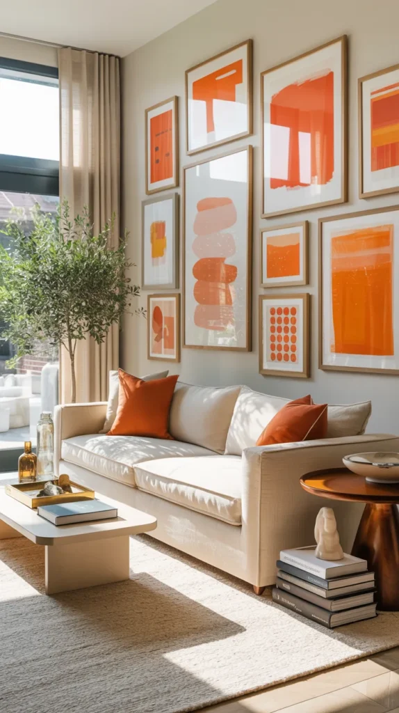
If you’re not ready for orange furniture, start with art — it’s the lowest commitment, highest impact change you can make. An orange-toned gallery wall filled with abstract paintings, warm gradients, or graphic prints instantly energizes a neutral living room. Keep the frames consistent — white, oak, or black — so the arrangement feels cohesive while the color stays playful. Suddenly the space has a focal point without moving a single piece of furniture.
The secret to making gallery walls look expensive is spacing and restraint. Leave breathing room between frames and avoid overcrowding so the eye moves naturally across the wall. When orange repeats across multiple artworks, it feels curated instead of random. And the best part? You can swap pieces seasonally — refreshing the entire room without redecorating everything.
4. Sculptural Orange Accent Chair
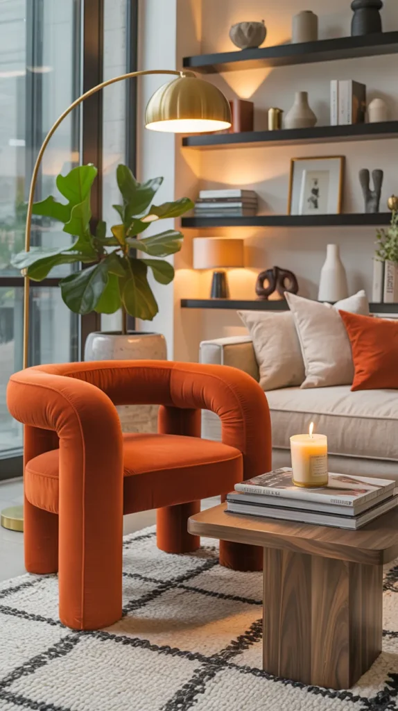
Sometimes a full sofa is too much, but a sculptural accent chair is perfect. Curved silhouettes — think rounded backs, boucle texture, or lacquered finishes — turn seating into art. Because the piece is smaller, you can go brighter with confidence. It becomes a conversation piece rather than a commitment, especially in a neutral room where it naturally draws attention.
Place it slightly angled, not pushed flat against the wall, and add a nearby lamp to highlight its shape. Now the chair acts like a visual anchor, grounding the room while keeping everything else flexible. This approach works beautifully if you like changing decor often — the chair stays as the signature element while pillows, throws, and accessories rotate around it. You get a bold focal point without redesigning the entire room, which is exactly how stylish spaces evolve over time.
5.Orange Wall
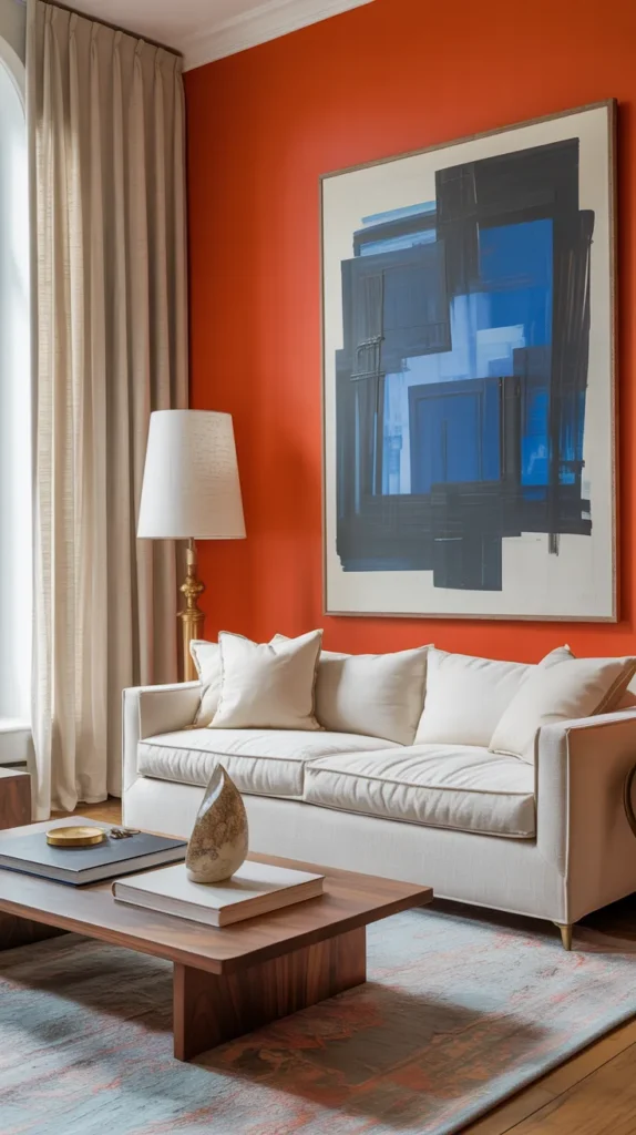
A full orange wall sounds intimidating until you realize it actually simplifies the entire room. Instead of trying to distribute color through decor, you let the architecture carry the personality. One bold painted wall instantly defines the space, especially in open-concept homes where living areas can feel undefined. The trick is choosing a clear, vibrant orange — not dusty or brown-toned — so the result feels fresh and intentional. Against light furniture, the color reads modern and confident rather than heavy.
Everything around it should calm the eye. Think cream upholstery, pale woods, linen textures, and minimal decor so the wall becomes the statement instead of competing with it. Add only a few small echoes of orange — a book spine or pillow — just enough to connect the palette. When the color has room to breathe, the space feels curated rather than overwhelming. The wall becomes a backdrop that highlights every object in front of it, proving bold color works best when paired with restraint and balance.
6. Orange and Chrome Modern Contrast
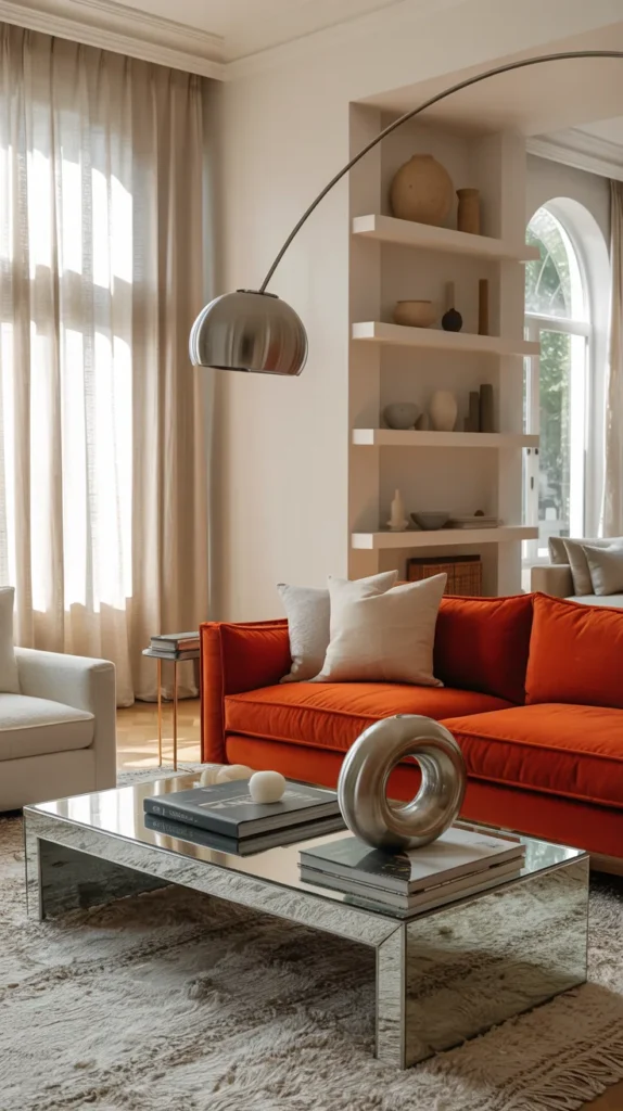
Orange instantly feels more sophisticated when it’s paired with reflective materials. Instead of soft cozy styling, this combination creates a sharp, modern atmosphere where color looks intentional rather than decorative. Picture an orange sofa against a clean backdrop with a chrome floor lamp arching above it and a reflective coffee table bouncing light across the room. The shine cools the warmth of the color, which keeps the space from feeling heavy. This is why designers often mix warm color + cool material — the balance makes bold choices feel elevated.
To make the room livable instead of showroom-like, layer in softness. A plush rug, textured pillows, and a throw blanket prevent the space from becoming sterile. The goal isn’t to remove comfort, it’s to frame the color. When reflective surfaces highlight orange rather than compete with it, the furniture starts to feel like artwork and the living room takes on a gallery-inspired look. You end up with a space that feels stylish during the day and dramatic at night when light reflects across the metal finishes.
7. Orange Coffee Table Styling
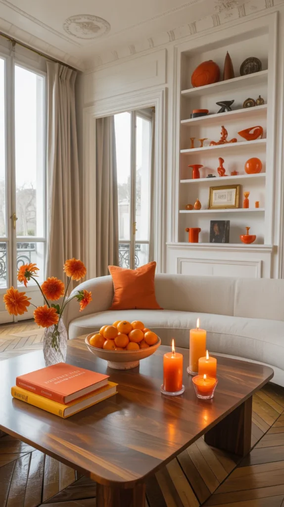
You don’t need to repaint or replace furniture to use color. Styling surfaces is often enough to transform the entire room. A neutral space can feel completely refreshed just by adding orange through books, trays, candles, and small decor pieces. The eye naturally notices horizontal surfaces first, so even small accents create a strong impression.
Repetition is what makes the color look intentional. When orange appears on the table, shelf, and nearby decor, the brain connects the palette automatically. Suddenly the room feels cohesive without any large changes. This approach works especially well for people who like to refresh their home seasonally because it allows flexibility while still creating a designed look.
8. Orange and Blue Balance
Orange becomes calmer when paired with a cool tone. Blue grounds the warmth and prevents the space from feeling overwhelming, creating a balanced environment. Use blue in grounding elements like rugs or art and let orange appear in seating or accents. The two colors support each other, making the room lively but comfortable.
Keep surrounding materials light so the palette can breathe. Natural textures and soft lighting help the contrast feel intentional rather than loud. This pairing works because it mirrors nature — warmth and coolness existing together. The result is a living room that feels energetic yet peaceful, proving that bold color can still create a relaxing atmosphere.
9. Orange Curtains
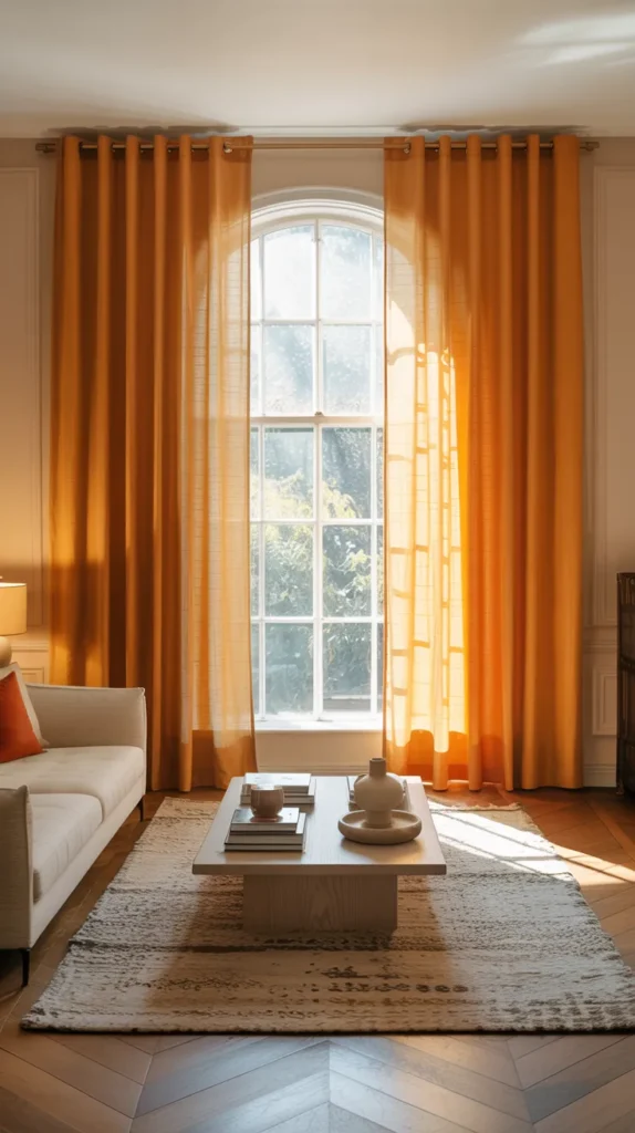
Curtains are one of the most underrated ways to introduce color because they influence the entire atmosphere of the room instead of just one object. When you hang orange curtains from ceiling height, the color becomes architectural — almost like adding warmth to the light itself. During the day, sunlight filters through the fabric and softly tints the room, creating a glow that furniture alone can’t achieve. At night, the curtains deepen the space, making the living room feel cozy and grounded without needing darker walls.
The key is letting them frame the room rather than dominate it. Pair them with neutral seating and simple decor so the eye moves naturally around the space. When orange lives at the edges of the room instead of the center, it feels intentional and balanced. The effect is subtle but powerful — the space feels warmer, calmer, and more designed without adding visual clutter.
10. Orange Shelf Styling
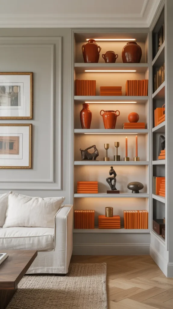
Shelves are storytelling surfaces. Instead of filling them randomly, use orange to create rhythm across the arrangement. Alternate books, ceramics, and small objects so the color appears in multiple heights and depths. The goal is visual flow — the eye should travel naturally from one section to the next.
Avoid symmetry and aim for balance instead. Too-perfect arrangements look staged, while varied heights feel lived in. By distributing orange carefully, shelves become part of the architecture rather than background storage. The living room suddenly looks intentional, even if the rest of the space remains simple.
12.Orange Throw Blanket
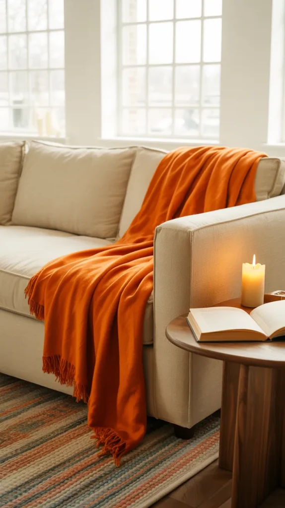
Soft elements change how a room is experienced more than hard ones. Draping an orange throw blanket over a sofa or chair immediately signals comfort, even before anyone sits down. Fabric breaks the straight lines of furniture and introduces movement, which keeps a space from feeling rigid. Because the color lives in something tactile, it feels welcoming rather than decorative.
The secret is avoiding perfection. A loose drape looks natural and inviting, while a folded edge feels staged. The blanket should look ready to use, not ready to photograph. When styling mirrors real behavior, the room becomes warmer both visually and emotionally — and that subtle authenticity is what makes interiors feel lived in.
Perfect — I’ll deepen these so they read richer, more immersive, and practical, like you’re guiding the reader through how the space actually feels and functions.
13.Orange Upholstered Bench
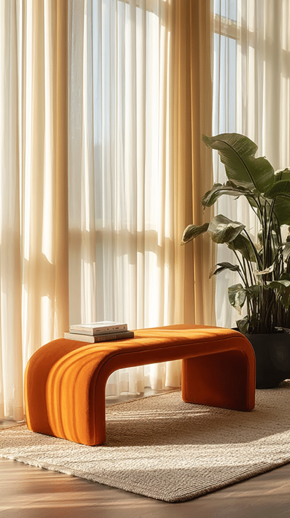
An orange upholstered bench changes circulation in a living room more than people expect. Placed behind a sofa or along an open wall, it quietly defines pathways so the room feels organized instead of floating. Because the color sits low to the ground, it anchors the layout without visually crowding eye level — which keeps the space calm even while adding boldness. The bench becomes a bridge between seating and walking space, turning empty areas into purposeful ones.
Styling should stay restrained so its shape and color remain clear. A folded throw, a single book stack, or a tray is enough to suggest use without turning it into a display table. When color lives in a functional object rather than decoration, the room feels naturally designed. The eye reads it as part of the architecture of living, not just an accessory, which is why the space feels more intentional overall.
14.Orange Glass Decor Cluster
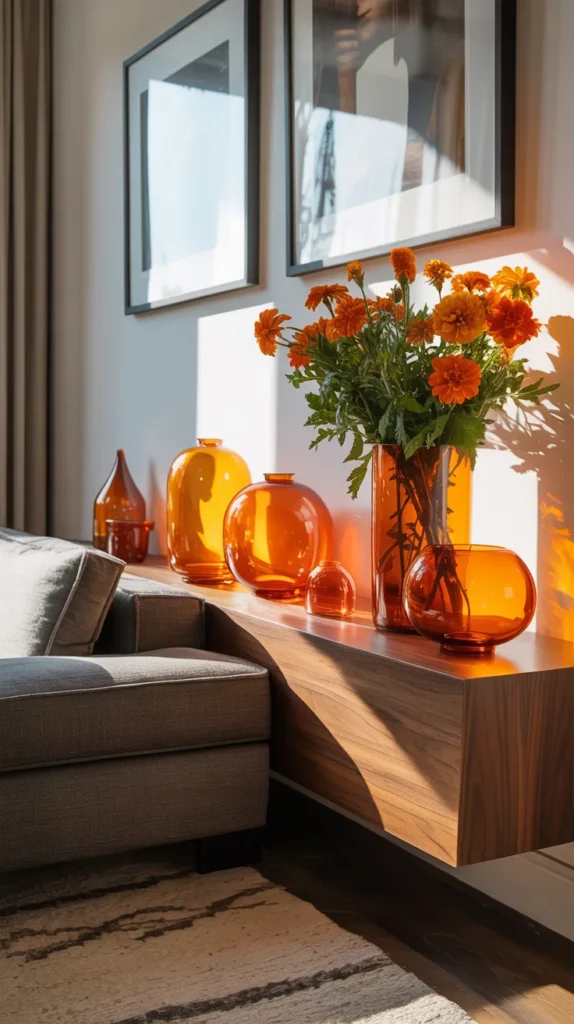
A cluster of orange glass decor changes the quality of light rather than just adding color. As sunlight passes through the translucent material, it casts subtle warmth across nearby surfaces, making the room feel softer throughout the day. Unlike opaque objects, the color shifts depending on the hour, so the decor interacts with time instead of staying static. This movement keeps the room visually interesting without needing more items.
Grouping is essential because repetition creates intention. Varying heights and spacing allows the eye to travel across the arrangement naturally, giving the surface a sense of rhythm. When placed where light reaches it — near a window or lamp — the pieces become atmospheric rather than decorative. The result feels layered and calm, a quiet presence that enriches the room instead of dominating it.
15.Orange Floor Lamp Base
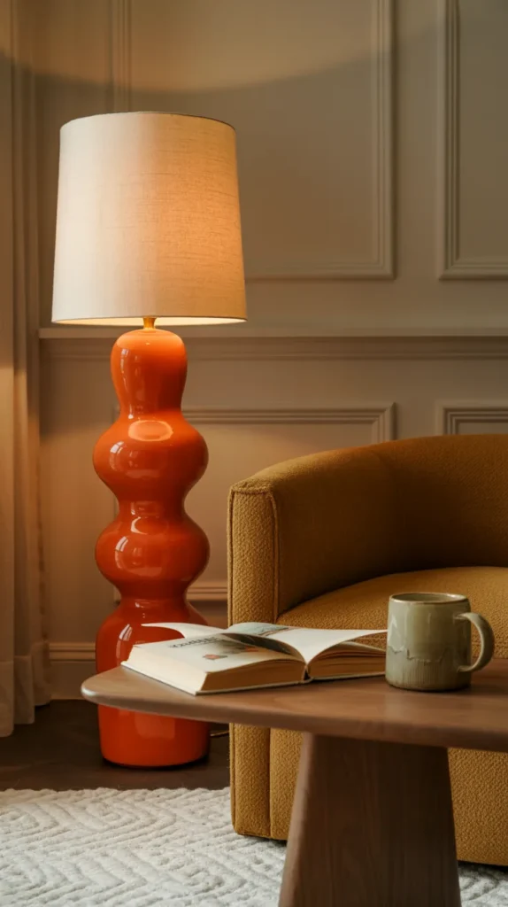
A colored floor lamp base introduces vertical structure, which many living rooms lack. Most color sits on walls or seating, but placing it at standing height connects those areas visually and stabilizes the composition. During the day the base works like a sculptural element, and in the evening the light reinforces its warmth, gently altering the entire mood of the room without changing anything else.
Position it where people naturally pause — beside a chair or near the end of a sofa — so it becomes part of the living experience. The lamp marks a zone within the larger space, giving the layout depth. Instead of filling corners with furniture, you’re defining them with atmosphere, which is often what makes a room feel thoughtfully arranged rather than simply furnished.
16.Orange Ottoman Instead of Coffee Table
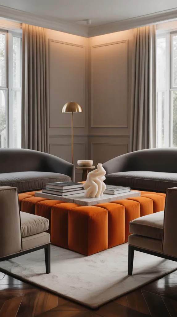
An orange ottoman softens the center of the living room and changes how people move through it. Hard tables create boundaries, while an upholstered surface invites interaction — sitting, resting feet, or placing a tray. Because the color sits at the heart of the layout, it connects all surrounding seating naturally and makes the arrangement feel cohesive.
Adding a tray restores structure while keeping comfort. The balance between firm and soft prevents the center from feeling either cluttered or empty. Over time the ottoman becomes part of daily habits, not just visual design. When color exists within something used constantly, the room feels lived in rather than styled.
17.Orange Trim & Molding
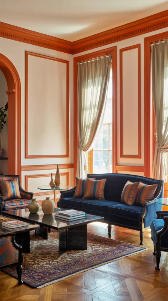
Painting trim and molding orange integrates color directly into the architecture of the room. Instead of placing boldness on furniture or walls, the outline of the space itself becomes expressive. The eye follows these lines around the perimeter, making the room feel clearer and more defined. Even simple furnishings appear intentional because the structure around them has presence.
Keeping walls simple allows the detail to remain readable. The contrast emphasizes proportion and makes the layout feel deliberate without adding extra decor. This approach works because it frames everything inside the room — once the edges feel finished, the interior naturally feels complete.
18.Orange Door Inside the Living Room
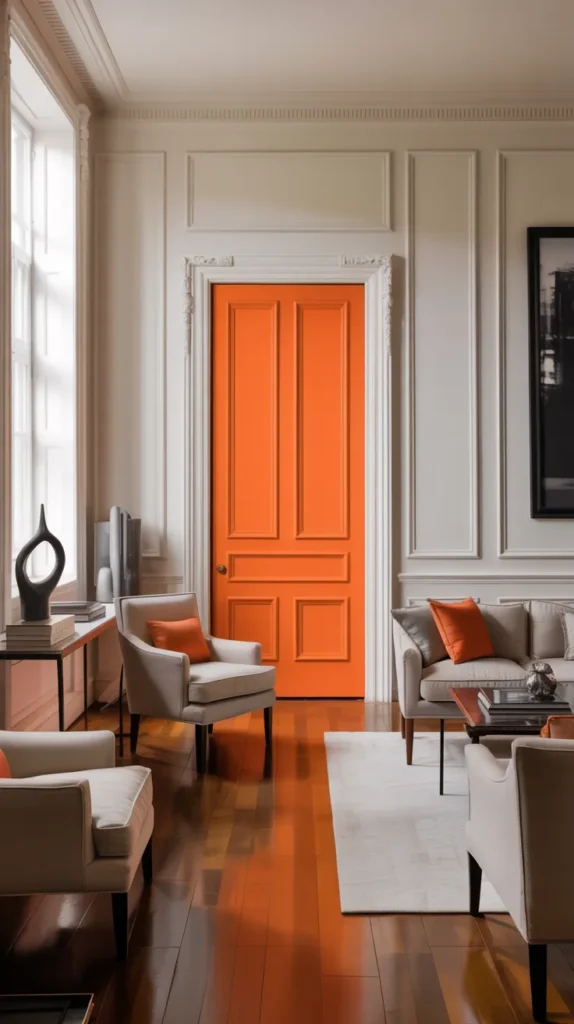
An orange interior door changes the character of a living room because it’s part of how you move through the space, not just something you look at. Unlike art or furniture, a door naturally draws attention every time it opens or closes, so the color becomes active instead of static. Even in a simple layout, the room suddenly feels intentional because the eye always has a destination. The contrast also breaks up large wall areas, which prevents the room from feeling flat or unfinished.
The key is letting the door anchor the surrounding zone. A nearby console, bench, or small object repeating the tone helps the color feel integrated rather than isolated. Because the color belongs to the architecture, the space looks designed without adding more decor. Over time it stops feeling like a bold choice and starts feeling like the natural center of the room — a detail that quietly organizes everything around it.
19.Orange Picture Frames
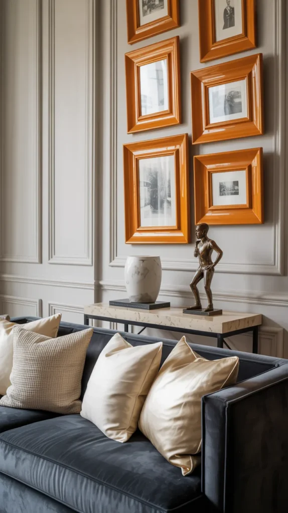
Changing the frames instead of the artwork shifts how the entire wall reads. Orange picture frames act like a border that connects different images into a single composition. Even unrelated prints begin to feel cohesive because the same color repeats around each one. The eye stops focusing on individual pieces and starts seeing a unified display.
Spacing becomes important here. Leaving breathing room between frames allows the color to guide the viewer naturally across the wall. Instead of a gallery that feels busy, you get rhythm and structure. The wall looks curated over time rather than assembled all at once, which makes the living room feel more personal and thoughtful.
20.Orange Striped Upholstery
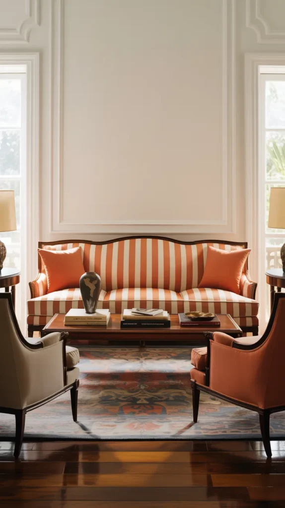
Pattern distributes color gradually, and orange striped upholstery keeps boldness controlled. The stripes lead the eye across the furniture, so the color never sits in one heavy block. Movement replaces weight, which makes the room feel energetic but still organized. It’s easier to live with than a fully solid piece because the visual intensity is broken into smaller moments.
Keep nearby surfaces calmer so the pattern remains readable. When balanced correctly, the stripes provide interest without needing additional decoration. The furniture becomes both functional and expressive — comfortable to use while still shaping the character of the space. The room feels lively yet composed, which is often the hardest balance to achieve.