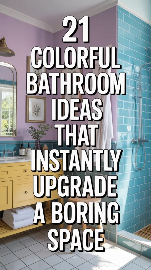
20 Colorful Bathroom Ideas That Instantly Upgrade a Boring Space
Bathrooms have quietly become the most predictable room in the house. Same safe palette, same polished look, same feeling you’ve already seen a hundred times online. It works — but it never wows. The truth is, a bathroom doesn’t need to be neutral to feel clean or expensive. In fact, designers often treat smaller rooms as the perfect place to experiment because color lands harder in compact spaces. A few intentional shades can transform an ordinary bathroom into the most memorable space in the home.
The key isn’t using one bold color everywhere — it’s layering multiple tones so the room feels curated instead of chaotic. When hues are balanced through tile, paint, cabinetry, and accents, the space starts to feel styled rather than decorated. The ideas ahead focus on combinations that feel elevated and designed, proving a colorful bathroom can still look polished, cohesive, and surprisingly sophisticated.
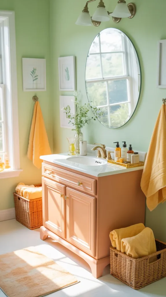
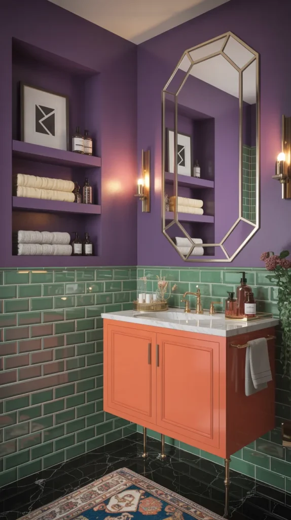
1. Peach + Mint + Gold Garden Bathroom
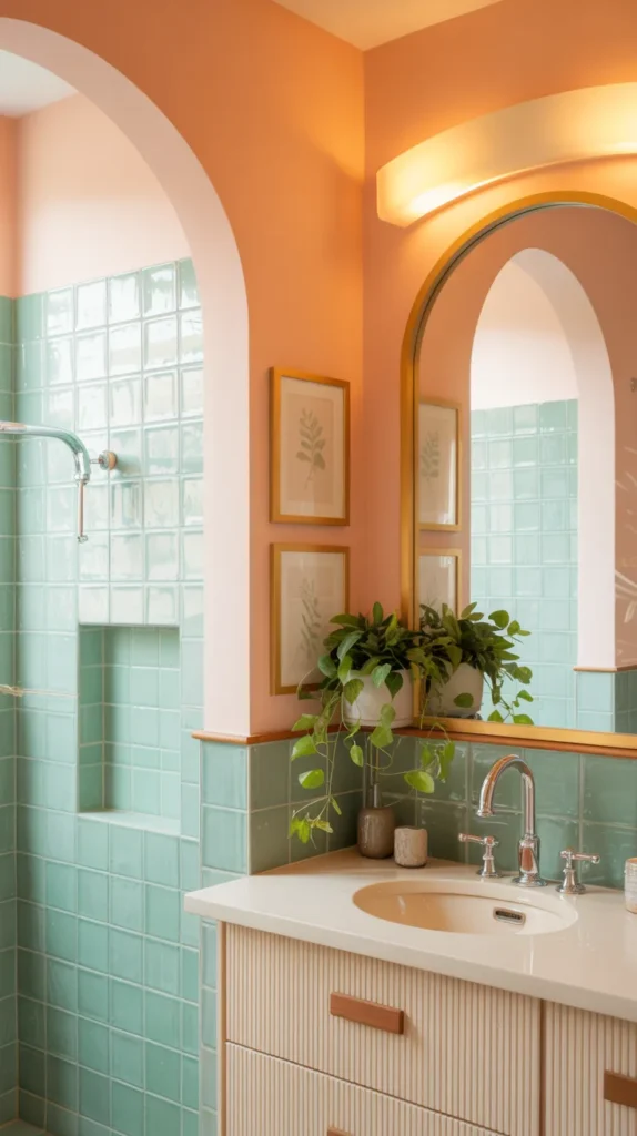
A peach wall instantly warms the room and removes that cold, sterile feeling bathrooms often have, while mint tile cools it back down so the space stays refreshing instead of heavy. The magic happens when the two are used on different surfaces — for example, peach on the upper walls and mint in the shower or backsplash. That separation keeps the palette feeling intentional rather than busy. Add curved shapes like an arched mirror or rounded sconces and suddenly the bathroom feels soft, almost botanical, instead of geometric and rigid. This combination works because the colors sit opposite emotionally: one is cozy, the other crisp, creating a balanced atmosphere you actually want to linger in.
Gold fixtures finish the look by adding a designed focal point rather than more color noise. Instead of adding more shades, the metallic acts like jewelry — small but powerful. A vanity in painted wood, leafy artwork, and a subtle floral runner reinforce the garden inspiration without turning the room into a theme. The goal here is not to shout color, but to layer warmth and freshness so the bathroom feels bright in the morning and calming at night. When done right, the palette reads elevated and curated, not pastel or childish.
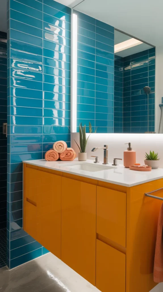
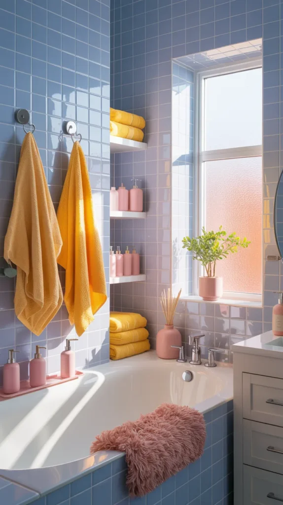
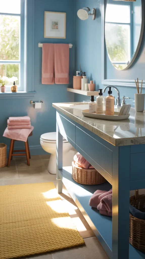
2. Sky Blue + Butter Yellow + Coral Coastal Bathroom
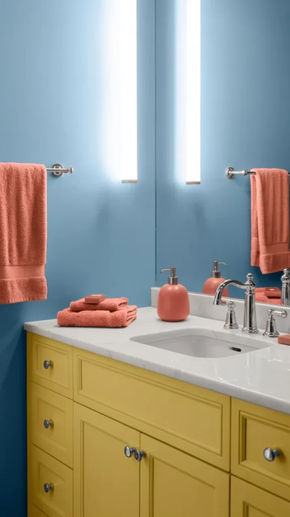
Sky blue walls create openness immediately — they visually push the walls outward and make even a tight bathroom feel airy. Butter yellow cabinetry brings sunlight into the space, preventing the blue from feeling cool or distant. The coral comes last and works best in controlled areas like towels, art, or a stool. That order matters: large calm color, medium warm color, then small energetic color. When layered this way, the palette feels structured instead of playful, which is what keeps it sophisticated.
What makes this combination successful is restraint in shapes. Keep fixtures simple, hardware minimal, and let color do the talking. A flat-front vanity, streamlined mirror, and clean tile layout stop the palette from drifting into beach-theme territory. The result feels more like a boutique hotel than a vacation rental. The contrast between gentle blue and warm accents creates a bathroom that feels bright, optimistic, and polished at the same time — energizing without overwhelming you first thing in the morning.
3. Lavender + Sage + Blush Romantic Bathroom
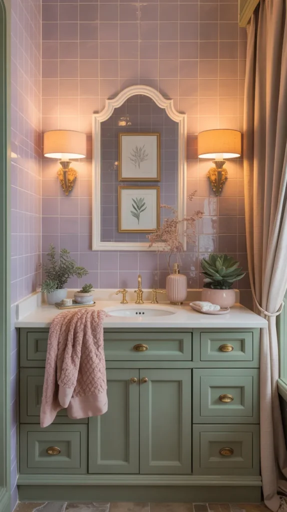
Lavender tile introduces personality immediately, but on its own it can lean cold. That’s where sage cabinetry grounds the space, giving the eye a resting point and preventing the room from feeling overly delicate. Blush accents soften both shades and act as the bridge between them. Instead of matching everything perfectly, let each color have its own moment — lavender in the wet areas, sage in storage, blush in textiles. This separation creates visual layering, which is what makes a colorful bathroom look designed rather than coordinated.
Lighting plays a huge role here. Warm sconces or pendants transform lavender from icy to inviting, making the palette feel calm instead of powdery. Small details — framed art, a pleated shade, curved hardware — enhance the romantic tone without making it feel vintage. The overall effect is gentle but intentional, like walking into a thoughtfully styled dressing room. It proves a bathroom can be soft yet sophisticated, colorful yet restful.
4. Aqua + Tangerine + Peach Modern Retro Bathroom
Aqua tile sets a refreshing base, but pairing it with tangerine cabinetry turns the space from calm to memorable. Peach accents soften the intensity so the room doesn’t become visually loud. The key is letting aqua occupy the largest area — typically shower walls — while tangerine becomes the feature piece. That hierarchy keeps the bathroom bold yet organized. Clean lines and flat surfaces modernize the palette so it feels editorial rather than nostalgic.
Instead of leaning into retro décor, keep accessories minimal: one framed print, a sleek mirror, simple lighting. This contrast between energetic color and restrained styling makes the design feel current. The bathroom ends up playful but not kitschy, vibrant but not chaotic. It’s the type of room that instantly wakes you up in the morning because the colors feel lively, yet still thoughtfully composed.
5. Pistachio + Pink + Cherry Red Playful Bathroom
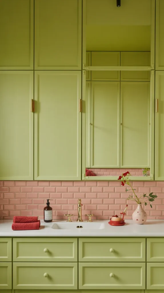
Pistachio walls provide a soft background that calms the brighter elements, allowing pink tile to stand out without dominating the space. Small cherry-red accents — a soap dispenser, artwork detail, or stool — introduce contrast and keep the palette from feeling overly sweet. The trick is using red sparingly; just a few touches create a visual anchor that sharpens the whole design.
Balancing shapes keeps this palette grown-up. Pair playful color with structured elements like rectangular tile, tailored cabinetry, and simple lighting. When the architecture is disciplined, the colors feel deliberate instead of decorative. The final look feels energetic and stylish — the kind of bathroom that sparks conversation because it’s unexpected but clearly intentional. It shows bold palettes can still look refined and curated, not childish.
6. Lilac + Butter Yellow + Baby Blue Soft Pastel Bathroom
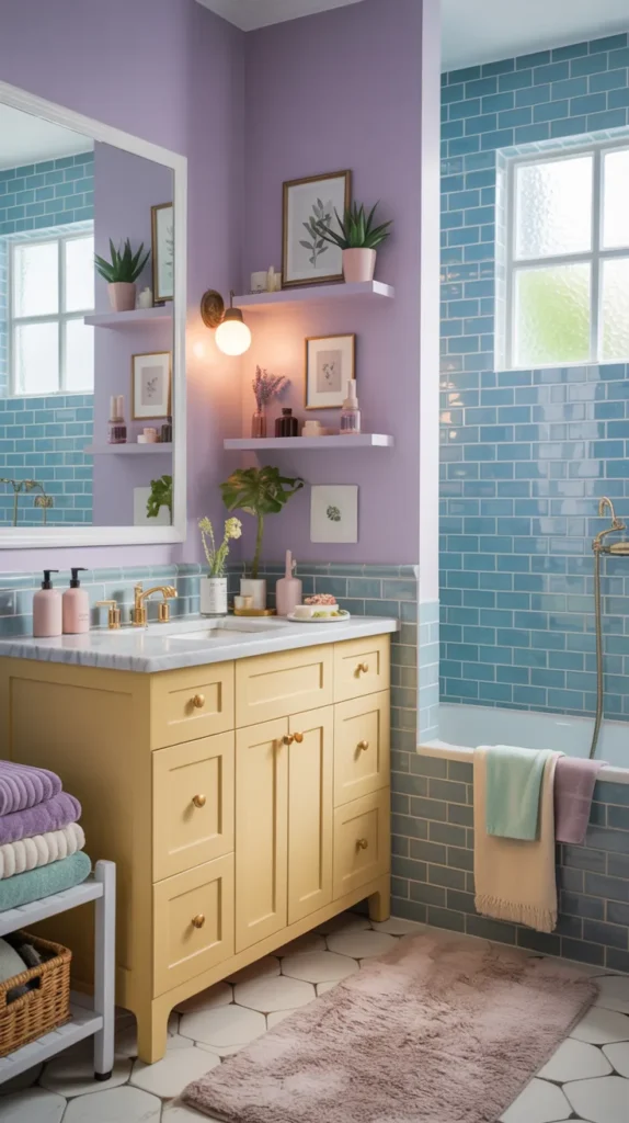
Lilac on the walls instantly gives the bathroom personality, but the reason this palette works is because it isn’t left alone. Baby blue tile cools the space and adds clarity, keeping lilac from feeling overly sweet. Butter yellow then steps in as the sunlight of the room — often on the vanity or shelving — warming everything without overpowering it. When each shade lives on a different surface, the bathroom starts to feel layered instead of matched. Your eye moves naturally around the space, which is what creates that subtle designer look.
Furnishings should feel intentional rather than decorative. A tailored vanity, structured lighting, and neatly stacked towels prevent the palette from drifting into nursery territory. Add a small framed artwork and a textured bath mat and suddenly the room feels like a carefully styled suite rather than a colorful experiment. The final effect is bright but gentle — a bathroom that feels uplifting, calm, and thoughtfully composed every time you walk in.
7. Teal + Marigold + Rose Eclectic Bathroom
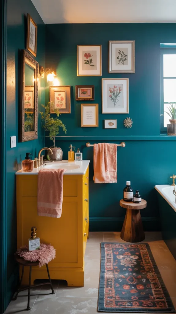
Teal works best as the foundation because it grounds the entire room and gives the color story weight. Marigold then warms the palette — often through cabinetry or a storage piece — making the space feel welcoming instead of dramatic. Rose accents soften both tones and keep the contrast approachable. This balance turns three bold colors into something that reads curated rather than chaotic.
The furnishings complete the atmosphere. A patterned runner, framed art, and a small stool make the bathroom feel collected over time instead of installed all at once. Layered accessories on the countertop — soap trays, trays, stacked books — help tie the colors together without adding more shades. The space ends up expressive but controlled, creating a bathroom that feels personal, artistic, and rich with character rather than loud.
8. Coral + Turquoise + Palm Green Tropical Powder Room
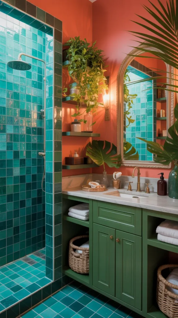
Coral immediately warms the room and makes it inviting, while turquoise tile refreshes the palette and adds crispness. Palm green enters through cabinetry or plants and stabilizes the whole composition so it feels grounded. The trio mimics nature — warm earth, water, and foliage — which is why it feels balanced even though it’s colorful. Instead of theme décor, the bathroom becomes a cohesive environment.
Keep furnishings simple and functional so color remains the focus. A clean mirror, woven storage baskets, and neatly folded towels allow texture to add depth without introducing clutter. The bathroom ends up feeling energizing but relaxing at the same time — a place that wakes you up in the morning yet still feels comfortable at night. It’s vibrant, but more importantly, harmonious and livable.
9. Periwinkle + Lemon + Petal Pink Cheerful Bathroom
Periwinkle creates a gentle backdrop that softens the entire room, giving your eye a calm starting point. Lemon accents then brighten the atmosphere and add movement, while petal pink rounds out the palette so the brightness feels warm instead of sharp. The key is scale: periwinkle covers the largest surfaces, lemon appears in medium features, and pink stays in smaller details. This hierarchy keeps the design organized and intentional.
Furnish the room with clean shapes so the palette remains polished. A simple mirror, structured vanity storage, and neatly arranged accessories help the colors breathe. Morning light reflects off the tones and gives the room a subtle glow rather than harsh brightness. The overall feeling is positive and welcoming — a bathroom that feels lively without overwhelming the senses, making it cheerful yet refined.
10. Mint + Lavender + Apricot Fresh Botanical Bathroom
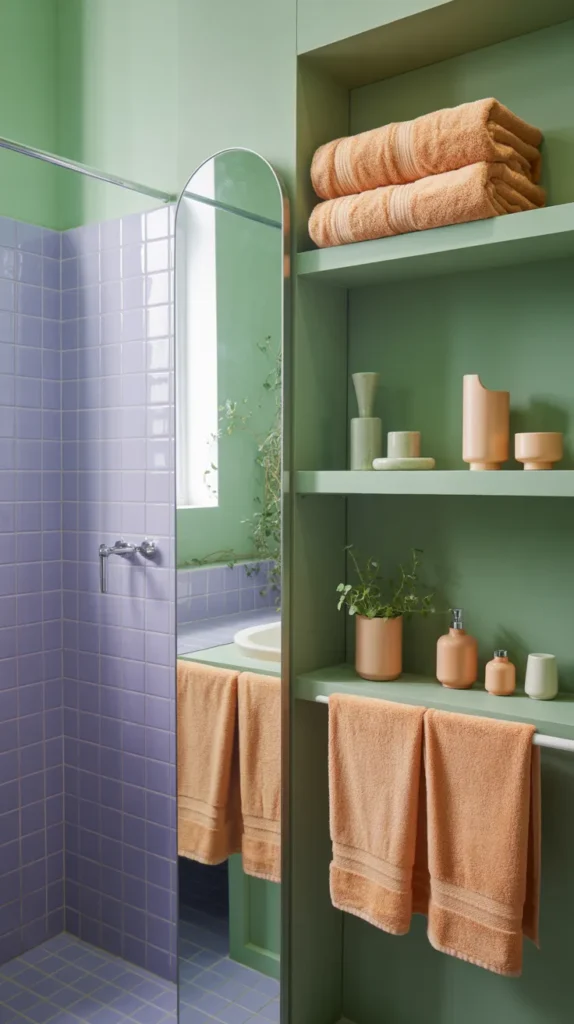
Mint provides freshness and clarity, lavender adds softness, and apricot warms the palette so it never feels cool. Instead of placing colors side by side randomly, use them in layers — tile below, paint above, accents throughout. This creates visual depth and makes the room feel styled rather than color-blocked. The palette feels connected because each shade supports the others, creating a balanced visual rhythm.
Lighting transforms the mood here. Warm illumination softens lavender and enriches apricot, giving the bathroom a gentle glow in the evening while mint keeps mornings crisp. Curved mirrors and ceramic accessories reinforce the relaxed tone without adding more colors. The result is a space that feels alive but calm — expressive yet comfortable — proving a colorful bathroom can still be peaceful and elegant.
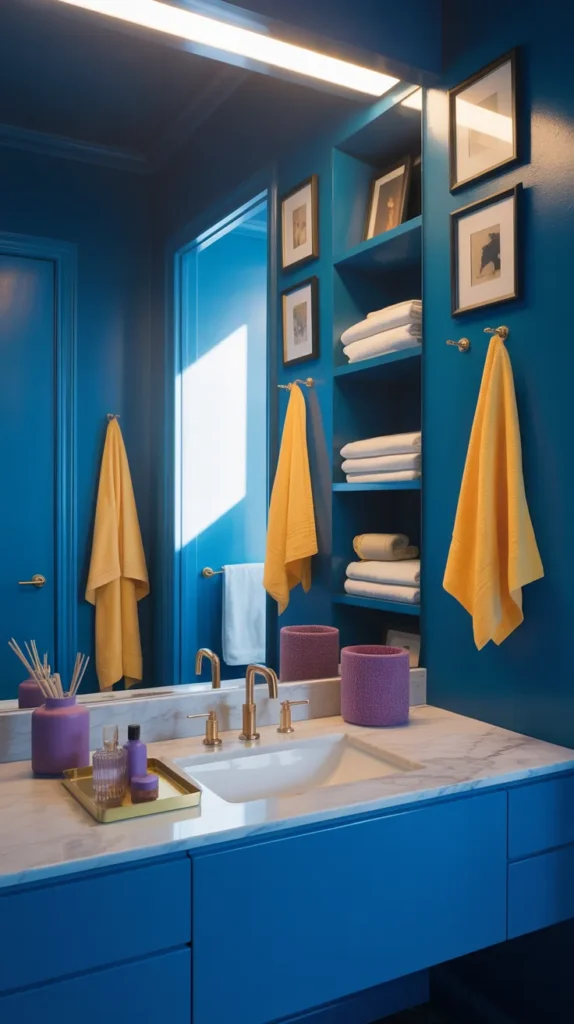
11. Cobalt + Fuchsia + Amber Dramatic Bathroom
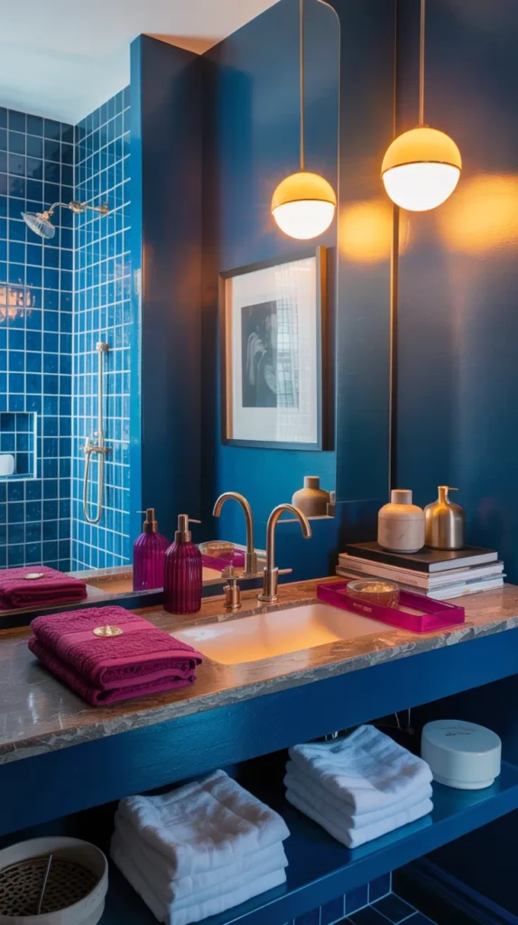
Cobalt works beautifully as the anchor because it adds depth immediately, giving the bathroom a strong foundation that feels intentional rather than loud. Fuchsia then energizes the space — often through textiles, art, or a vanity detail — creating contrast that feels expressive instead of overwhelming. Amber lighting softens both colors and introduces warmth, which is what keeps the palette from feeling harsh. Together, the three shades create a space that feels bold but controlled, almost like stepping into a carefully styled boutique interior.
Furnishings should stay sculptural and clean so the palette reads as design rather than decoration. A streamlined mirror, sleek storage, and minimal countertop accessories let the colors carry the personality. When light hits the surfaces, the tones shift subtly throughout the day, making the bathroom feel dynamic instead of static. The overall result is dramatic yet welcoming — a room that feels artistic, memorable, and unmistakably intentional.
12. Seafoam + Peach + Sunflower Yellow Happy Bathroom
Seafoam keeps the room relaxed and refreshing, acting as the calming backdrop that allows brighter tones to shine. Peach softens the palette so it feels warm and approachable, while sunflower yellow adds cheerful energy in smaller areas like textiles or accessories. The balance prevents the bathroom from becoming overly sweet or overly bright. Instead, the colors interact in a way that feels joyful yet grounded.
To keep the atmosphere refined, use practical furnishings arranged neatly — folded towels, simple shelving, and an uncluttered vanity surface. The palette feels sunny but still composed because nothing competes for attention. This kind of bathroom naturally boosts mood without overstimulation, making daily routines feel lighter. The final impression is welcoming and lively, yet still cohesive and comfortable.
13.Cobalt + Lemon + Orchid Modern Artistic Bathroom
Cobalt walls add depth and drama immediately, giving the room presence even before styling. Lemon accents brighten the atmosphere, preventing the blue from feeling heavy, while orchid details soften the palette and add warmth. Together they create contrast that feels expressive yet cohesive — the bathroom reads creative instead of busy.
Artwork and structured storage reinforce the aesthetic. When accessories are curated rather than crowded, the palette feels like part of a design concept rather than decoration. The space ends up vibrant but controlled — a bathroom that feels unique and personal while still elevated and intentional.
14. Robin’s Egg Blue + Tulip Pink + Goldenrod Vintage Bathroom
Robin’s egg blue provides softness and nostalgia, giving the room a gentle backdrop. Tulip pink introduces warmth and keeps the palette from feeling delicate, while goldenrod adds depth and contrast in small accents. Together they echo vintage interiors, but when paired with modern shapes the result feels updated. The palette reads timeless rather than themed.
Furnishings play a big role here — simple cabinetry, clean lighting, and carefully placed décor keep the design polished. A framed print or patterned textile ties the colors together without overwhelming the room. The bathroom ends up charming but still sophisticated, showing how color can feel classic instead of trendy. The final effect is warm, inviting, and comfortably elegant.
15. Raspberry + Mint + Sky Blue Playful Bathroom
Raspberry brings energy immediately, while mint softens and cools the palette so it doesn’t feel overpowering. Sky blue balances both by adding openness, creating a space that feels lively but breathable. When the colors are distributed thoughtfully — raspberry as the accent, mint as the base, blue as the connector — the bathroom feels balanced instead of busy.
Structured furnishings keep the palette mature. Clean storage, simple hardware, and organized accessories allow the colors to stand out without chaos. The result feels vibrant yet composed, like a carefully styled studio set rather than a novelty room. It’s cheerful but still polished, proving playful palettes can remain refined and intentional.
16. Turquoise + Apricot + Lime Zest Bathroom
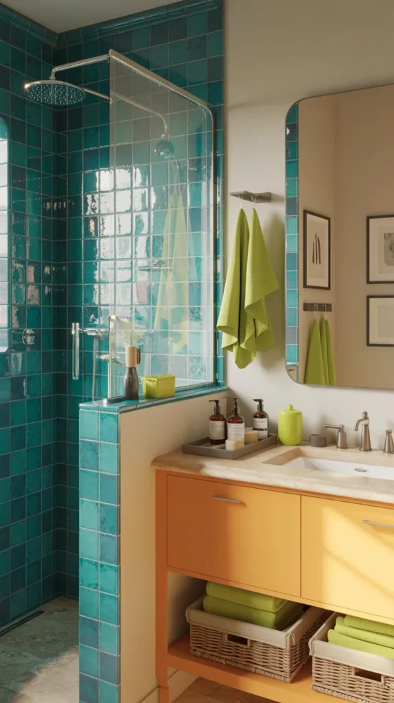
Turquoise immediately energizes the room and makes the space feel crisp, almost refreshing the moment you walk in. Apricot softens that brightness and prevents the bathroom from feeling sharp, while lime zest details add a spark of contrast that keeps everything lively. The key is letting turquoise carry the larger surfaces — shower walls or tile — while apricot warms cabinetry and lime appears in smaller accents. This layered distribution creates movement and balance, so your eye travels comfortably instead of jumping between colors.
To keep the palette elevated, the furnishings should feel orderly and structured. Neatly arranged storage, a simple mirror, and folded textiles make the colors look intentional rather than spontaneous. When sunlight hits the surfaces, the tones feel almost glowing, turning an everyday routine into a more upbeat experience. The result is vibrant yet composed — a bathroom that feels energetic but still cohesive and livable.
17. Violet + Coral + Pistachio Art Deco Inspired Bathroom
Violet introduces depth and elegance, giving the room a strong visual backbone. Coral warms the palette and adds approachability, while pistachio softens both and prevents the space from feeling dramatic. Together, the trio creates contrast without tension because each color plays a different role: anchor, warmth, and relief. This hierarchy makes the bathroom feel designed instead of decorated.
Structured patterns enhance the effect. Repeating shapes in tile, mirrors, or lighting create rhythm so the colors feel organized. A carefully styled countertop and tidy shelving keep attention on the palette rather than clutter. The space ends up sophisticated and memorable — bold yet controlled — proving strong color combinations can still feel refined and elegant.
18. Baby Blue + Rose + Buttercup Floral Bathroom
Baby blue provides openness and gives the room a gentle foundation. Rose warms the atmosphere so the palette doesn’t feel cool, and buttercup yellow brightens key areas to keep the space cheerful. When layered thoughtfully, the bathroom feels welcoming rather than sweet. The eye recognizes harmony first, not color intensity, which is what makes the design comfortably inviting.
Soft textures help reinforce that mood. Folded towels, subtle artwork, and neatly placed accessories create warmth without clutter. Morning light enhances the tones and makes the room glow softly instead of shining brightly. The result is a bathroom that feels optimistic but calm — colorful while still peaceful and relaxing.
19. Emerald + Peach + Lilac Jewel Spring Bathroom
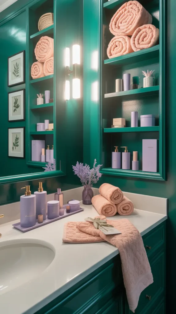
Emerald grounds the palette and gives the room richness immediately. Peach warms the space and keeps the green approachable, while lilac adds softness so the contrast feels smooth. Instead of competing, the colors complement one another, creating depth and dimension across surfaces. This makes the bathroom feel layered and intentional rather than busy.
Keep furnishings clean and deliberate so the palette stands out. A clear vanity surface, simple storage, and thoughtful placement of accessories help the colors read as design choices. Lighting enhances the warmth of peach and the depth of emerald, creating a balanced atmosphere throughout the day. The space ends up expressive yet calming — a combination that feels both lively and quietly sophisticated.
20. Sunset Palette Bathroom (Coral + Apricot + Pink + Golden Yellow)
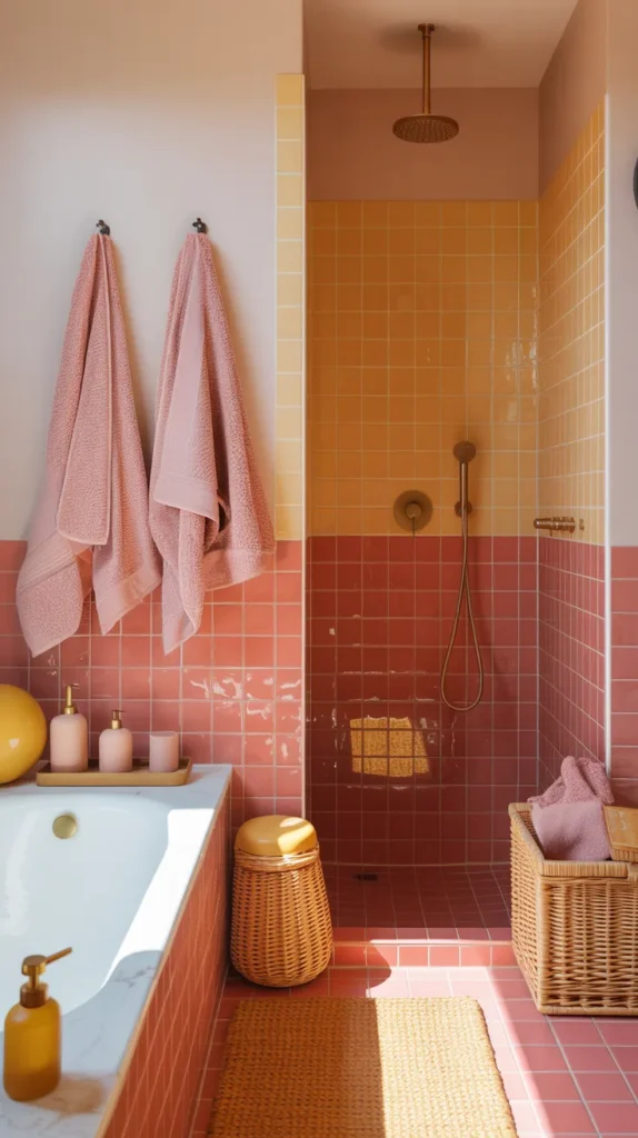
A gradient of coral, apricot, pink, and golden yellow creates warmth that feels natural rather than decorative. The tones blend into one another so the bathroom feels immersive, almost glowing from every angle. Using them across tile, textiles, and decor produces continuity, which is what keeps multiple colors from feeling overwhelming. The palette reads as one cohesive environment instead of separate shades.
Furnishings should remain simple so the gradient becomes the feature. A clean mirror, tidy storage, and minimal accessories allow the colors to carry the mood. Throughout the day the lighting changes the atmosphere — brighter in the morning, softer in the evening — making the bathroom feel dynamic. The final effect is comforting and memorable, proving bold color can still be warm, calm, and beautifully balanced.