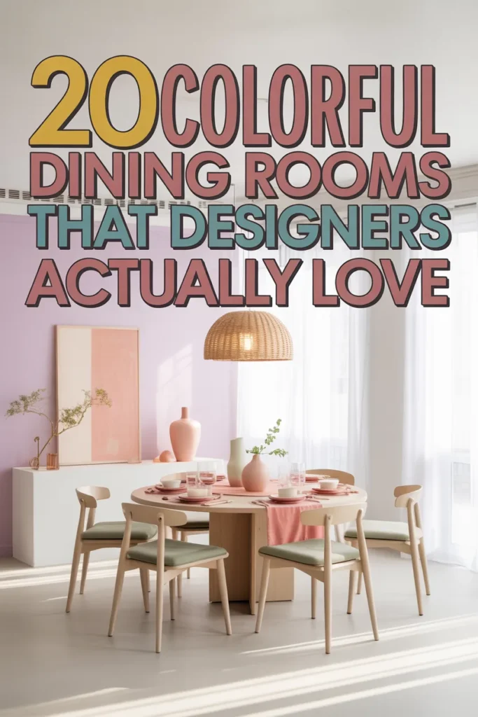
20 Colorful Dining Rooms That Designers Actually Love
For a long time, dining rooms followed the same formula — wood table, neutral chairs, safe walls, repeat. The space looked nice, but it rarely felt memorable. Now designers are shifting away from playing it safe and using color as the main feature instead of an accent. A bold dining room instantly changes the mood of a home. It becomes a place people linger in, talk longer in, and actually notice instead of just passing through.
Color doesn’t have to feel chaotic or overwhelming. When chosen intentionally, it creates structure, contrast, and personality all at once. Bright paint, playful furniture, and layered palettes can make a space feel elevated rather than loud. These ideas show how strong color choices can still look polished, balanced, and thoughtfully designed — proving a dining room can be both vibrant and sophisticated at the same time.
1. Lemon Yellow Walls + Sky Blue Chairs
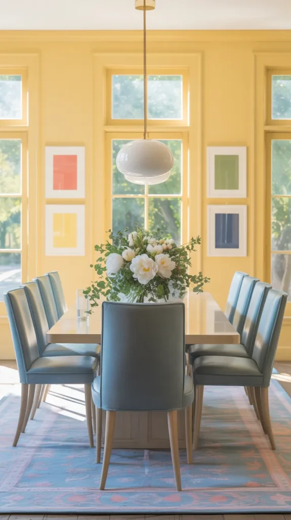
There’s something instantly uplifting about walking into a room wrapped in soft lemon yellow walls. The color reflects light in a way neutrals never can — instead of flattening the space, it gently glows. When paired with sky blue dining chairs, the room feels open and breathable, almost like natural daylight has been painted onto the surfaces. The key is choosing a buttery yellow rather than neon; think sunlight filtering through linen curtains rather than a highlighter marker. Suddenly the dining room stops feeling like a formal zone and starts feeling like a place people actually want to sit and talk.
Blue chairs ground the palette so it doesn’t feel sugary. They add calmness and create a visual horizon line around the table, which subconsciously makes the room feel larger. Add a glass or light wood table and the colors stay crisp instead of heavy. This pairing works because it mimics nature — sky and sunlight — which is why it feels energetic but still relaxing. The result is a dining room that feels fresh, optimistic, and effortlessly welcoming rather than overly decorated.
2. Blush Pink Room + Cherry Red Table
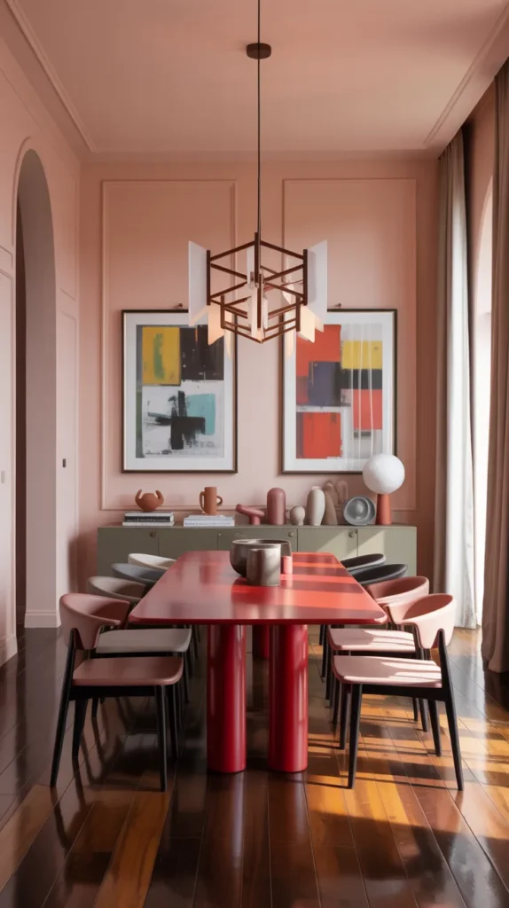
A blush pink dining room can easily lean sweet, but introducing a deep cherry red table instantly changes the tone from delicate to confident. The pink softens the walls and keeps the space airy, while the saturated red anchors the center of the room like a piece of modern art. Instead of competing, the colors create hierarchy — the walls become atmosphere and the table becomes the focal point. It’s a simple shift that makes the room feel curated instead of themed.
What makes this combination sophisticated is contrast in intensity, not contrast in color family. Because both hues are warm, they harmonize naturally while still feeling bold. Add sculptural lighting or minimal decor and the palette suddenly reads gallery-inspired rather than romantic. The room feels intentional, expressive, and designer-level polished, proving strong color doesn’t have to feel loud to feel powerful.
3. Mint Green Walls + Coral Seating
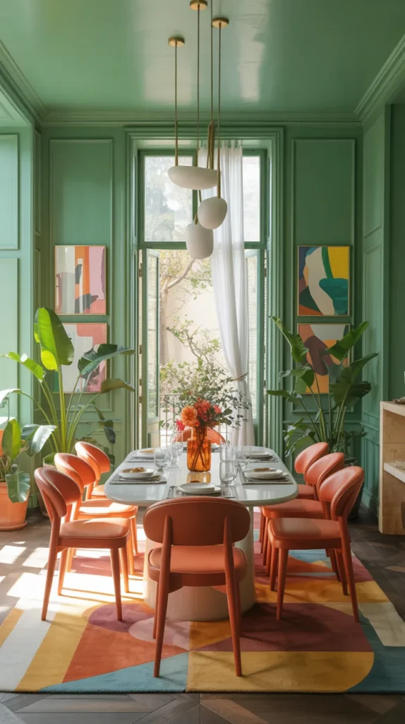
Mint green walls instantly cool a space without making it cold. The color reflects light softly, creating a gentle glow that makes everything in the room look better — especially warm tones. That’s where coral seating transforms the entire atmosphere. Against mint, coral feels lively instead of overwhelming, almost like flowers placed against fresh leaves. The room takes on a relaxed social energy, perfect for long dinners and casual gatherings.
This palette works best when textures stay simple so the colors can lead. Smooth painted walls, clean upholstery, and minimal patterns allow the contrast to feel modern rather than retro. The overall effect is cheerful but grown-up — the type of room that feels designed, not decorated. Together, the hues create a space that feels friendly, bright, and naturally inviting without needing layers of accessories.
4. Lavender Walls + Butter Yellow Accents
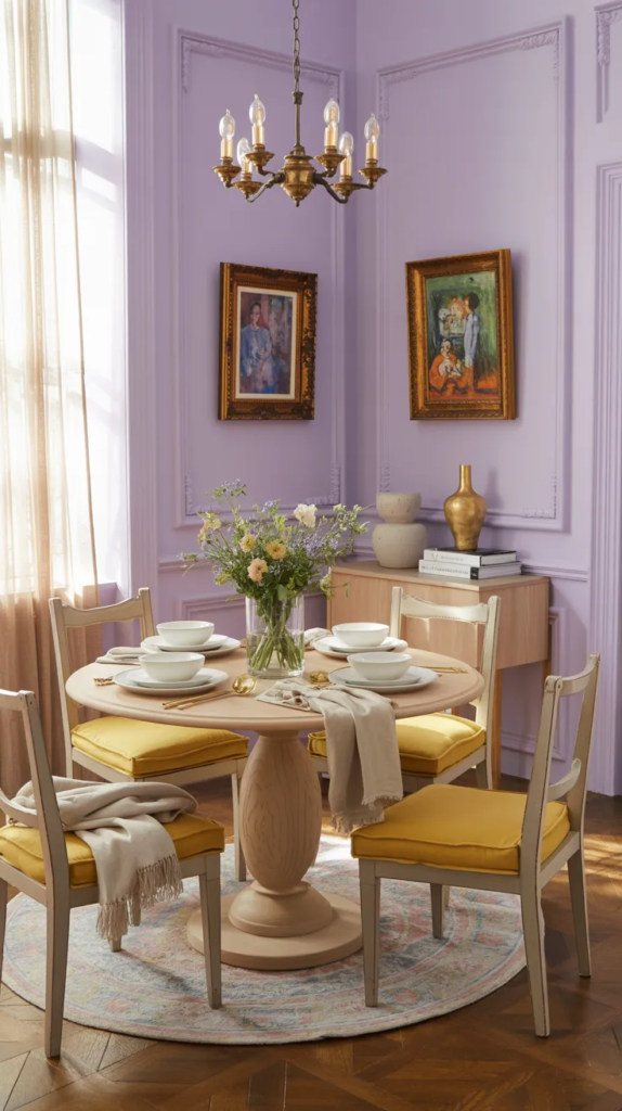
Lavender walls bring softness without disappearing into the background. Unlike gray or beige, they carry personality while still behaving like a neutral base. When paired with butter yellow accents — cushions, art, or lighting — the room immediately warms up. The yellow prevents lavender from feeling cool or distant, while lavender keeps yellow from feeling sharp. The balance creates a calm but happy atmosphere.
Because both shades are light-reflective, the dining room feels larger and more open. White trim or pale flooring keeps the palette airy, while a darker table adds gentle contrast. The effect is elegant but approachable, like color used in a thoughtful way rather than a bold statement attempt. The space ends up feeling soft, welcoming, and quietly uplifting, perfect for everyday meals.
5. Turquoise Walls + Tangerine Accents
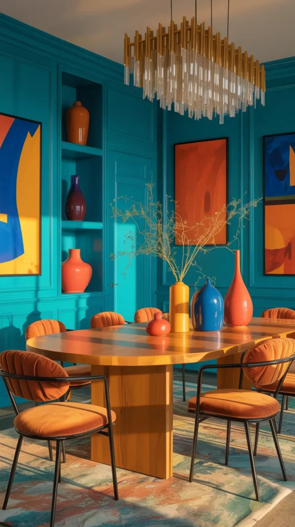
Turquoise walls instantly energize a dining room. They carry depth without darkness and brightness without harshness, making the space feel vibrant even before furniture is added. Introducing tangerine accents — artwork, vases, or a sideboard — adds warmth that keeps the blue from feeling aquatic. Together, the colors create movement in the room, drawing the eye around the space instead of letting it sit flat.
The trick to making this palette look refined is distribution. Small bursts of orange repeated around the room feel intentional and cohesive rather than random. Warm wood or brass finishes help bridge the two hues so they feel connected. When done right, the dining room feels lively but balanced — a place that encourages conversation and creativity. The overall mood becomes bold, energetic, and surprisingly sophisticated rather than overwhelming.
6. Peach Walls + Aqua Furniture
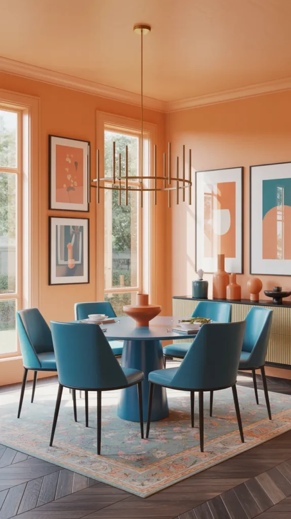
Peach walls instantly warm a dining room in a way beige never can. Instead of fading into the background, the color gently wraps the space and makes skin tones, wood finishes, and food all look better — which matters more in a dining room than anywhere else. Pairing it with aqua furniture keeps the palette from feeling overly warm and adds refreshing contrast. The cool tone breaks up the sweetness so the room feels balanced rather than themed.
The success of this palette comes from emotional temperature. Peach makes the room inviting, while aqua makes it feel clean and airy. Together they create a space that encourages conversation because it feels relaxed but still visually interesting. With simple lighting and minimal decor, the colors do the work. The result feels welcoming, fresh, and naturally lively — a room people want to linger in instead of rushing out of.
7. Periwinkle Walls + Poppy Red Art
Periwinkle is one of those rare colors that reads soft without disappearing. It has enough pigment to hold attention but still reflects light beautifully, making the room feel open. Adding poppy red artwork introduces a bold focal point that immediately gives the eye somewhere to land. Instead of filling the room with many colors, this approach relies on one strong contrast to make the space memorable.
Because the red is contained in art rather than furniture, it feels intentional rather than overwhelming. The walls become atmosphere while the artwork becomes personality. Keeping the table and seating simple lets the contrast stay sophisticated. The overall effect is clean, artistic, and quietly dramatic — more gallery dining room than decorative dining room.
8. Pistachio Green Room + Lilac Chairs
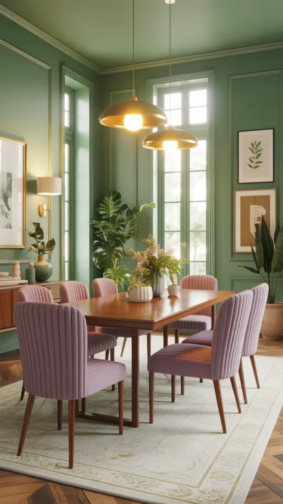
Pistachio green has a softness that feels comforting rather than vibrant, but introducing lilac dining chairs shifts the room into playful territory. The two colors share a pastel base yet still contrast enough to create visual movement. Instead of one dominant hue, the room feels layered — almost like color is floating around the table rather than sitting on surfaces.
This palette works especially well in spaces meant for gathering because it feels friendly without feeling childish. The gentle tones reduce visual stress while still keeping interest. With warm lighting and simple table styling, the space becomes inviting for everyday meals and long conversations. The final impression is cheerful, relaxed, and thoughtfully styled.
9. Sunflower Yellow + Cobalt Blue Combo
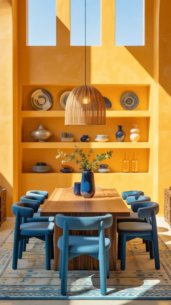
Sunflower yellow immediately energizes a room, but on its own it can feel intense. Introducing cobalt blue elementsanchors the brightness and gives the space depth. The blue absorbs some of the visual energy while letting the yellow stay joyful. The pairing feels timeless because it mirrors classic ceramic and Mediterranean color traditions.
Balance matters here — the yellow should dominate the surfaces while the blue appears in furniture, lighting, or decor. When distributed around the room, the colors feel cohesive instead of high contrast. The dining room ends up feeling bold yet grounded, vibrant but comfortable enough to use daily.
10. Coral Dining Room + Teal Sideboard
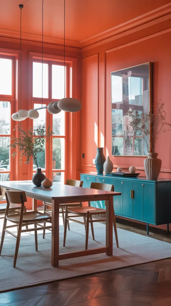
Coral walls bring warmth and personality instantly, but what elevates the space is adding a teal sideboard or storage piece. The furniture becomes a statement rather than just function. Because coral and teal sit opposite in temperature, the contrast makes both colors look richer and more intentional.
Repeating small touches of teal around the room ties everything together — glassware, art, or textiles — so the furniture doesn’t feel isolated. Keeping the table simple prevents visual competition and lets the palette feel curated. The finished space reads confident, expressive, and designer-level cohesive, not busy.
11. Hot Pink Chairs + Orange Rug
Sometimes you don’t need to repaint the entire room to make a statement — you just need bold seating. Hot pink dining chairs instantly energize the table and give the space personality the moment you walk in. When paired with a warm orange rug, the room feels layered rather than loud because the color sits low to the ground while the pink sits at eye level. The combination creates movement around the table and keeps the space visually active even when it’s empty.
This works best when the surrounding elements stay simple so the furniture can lead. A clean table and minimal wall decor let the palette feel intentional instead of chaotic. Because both colors are warm, the contrast feels harmonious rather than sharp. The final result is a dining room that feels playful, confident, and surprisingly sophisticated — proof that furniture alone can define a space.
12. Strawberry Red Walls + Baby Blue Trim
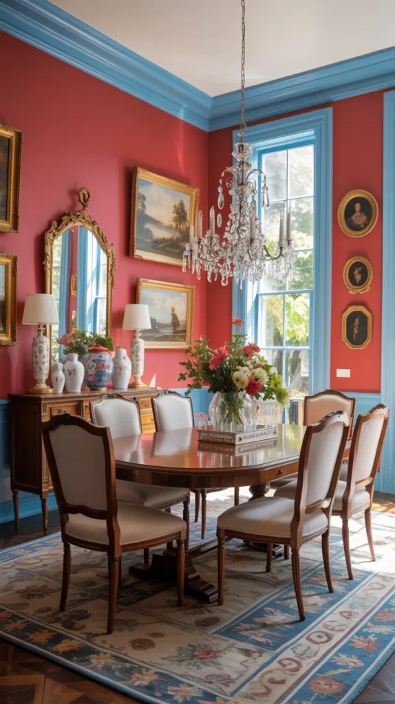
Painting trim a different color changes everything. With strawberry red walls, the dining room instantly feels rich and enveloping, but adding baby blue trim keeps the color from becoming heavy. The lighter outline frames the architecture and gives the eye places to rest, almost like matting around a painting.
This approach makes the room feel thoughtful instead of dramatic for the sake of drama. The contrast highlights windows, doors, and molding so the architecture becomes part of the design. Keep furniture simple and let the walls do the storytelling. The space ends up feeling bold yet balanced, cozy without becoming dark.
13. Apricot Walls + Botanical Greenery
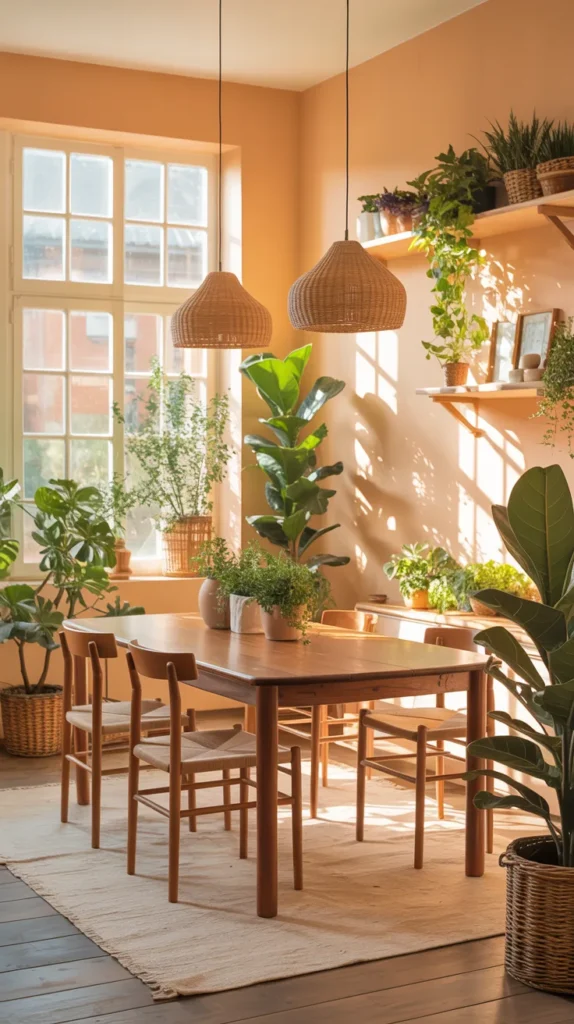
Apricot is one of those colors that quietly improves a room. It warms everything — wood, metals, and skin tones — making the space instantly comfortable. Filling the room with lush green plants transforms it into a dining space that feels alive rather than decorated. The greenery softens the walls while the walls warm the greenery, creating natural harmony.
Because the palette comes from nature, the room never feels overdesigned. A simple table, woven textures, and natural light allow the colors to breathe. Instead of high contrast, the space relies on atmosphere. The result feels relaxed, organic, and welcoming, like a space meant for slow meals and conversation.
14. Aqua Walls + Multicolor Gallery Wall
Aqua walls provide energy without heaviness — they brighten the room while still feeling calm. Adding a multicolor gallery wall turns the dining room into a creative space rather than a formal one. Different art pieces introduce variety while the consistent wall color keeps everything unified.
The key is repetition. When small color accents from the artwork echo around the room — in tableware, textiles, or decor — the space feels cohesive instead of busy. The dining room becomes expressive but still organized. The overall impression is artistic, lively, and curated rather than cluttered.
15. Lime Green Accent Wall + Purple Velvet Chairs
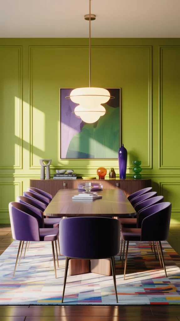
This pairing sounds unexpected, which is exactly why it works. A lime green accent wall injects brightness into the room, while purple velvet chairs add depth and softness. The high contrast creates a focal point without requiring complex styling — the colors themselves become the design.
Velvet texture prevents the palette from feeling sharp by adding richness and shadow. Repeating small hints of purple or green around the space ties the look together so it feels intentional. The finished room reads bold, dramatic, and designer-confident, not experimental.
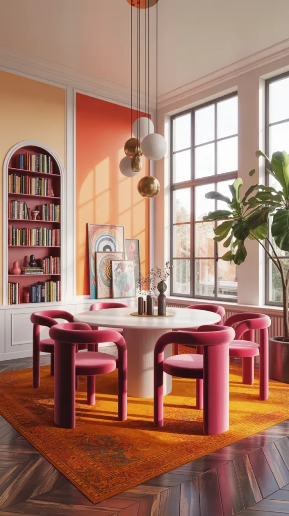
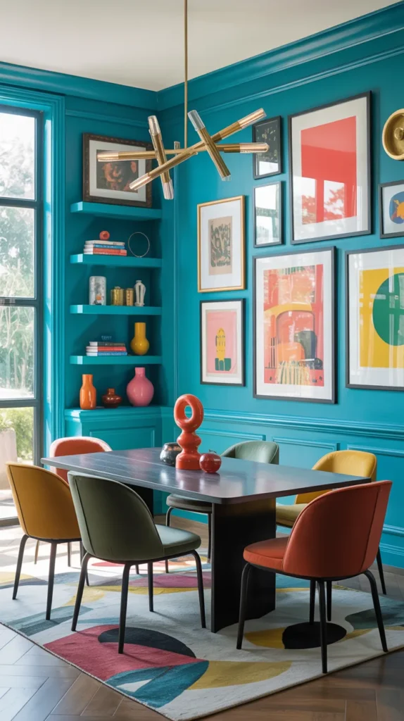
16. Color-Blocked Walls in Multiple Bright Shades
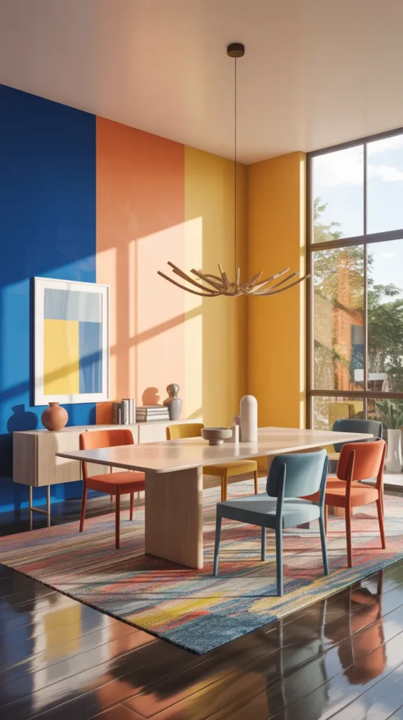
Instead of choosing one paint color, divide the walls into large sections of different hues. A color-blocked dining roominstantly feels intentional because the architecture becomes part of the design. One wall might be soft peach, another cobalt, and a third buttery yellow — yet the room still feels cohesive when the saturation level stays similar. The eye reads it as composition rather than chaos, almost like stepping into a painting you can sit inside.
To keep the space elevated, let furniture stay simple and repeat each color at least once in small details — glassware, artwork, or upholstery piping. This makes the palette feel planned rather than random. The final look feels creative, expressive, and confidently modern, turning the dining room into a conversation piece even before anyone sits down.
17. Retro Inspired 70s Palette Dining Room
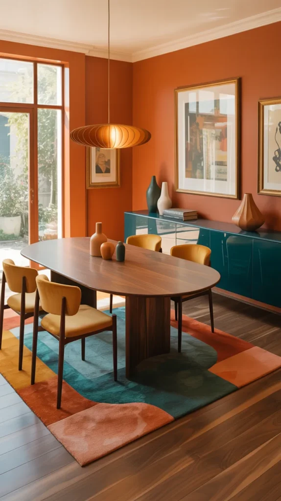
A 70s-inspired palette works today because it balances warmth and depth. Think burnt orange, mustard, and deep tealused together in clean modern shapes instead of vintage clutter. The warmth makes the room feel comfortable while the darker contrast keeps it grounded and mature. Instead of nostalgia, it reads as character.
Keep silhouettes contemporary — smooth tables, rounded chairs, simple lighting — so the palette feels updated. When done right, the space doesn’t look themed; it looks curated with personality. The dining room becomes rich, welcoming, and stylishly nostalgic without feeling dated.
18. Bright Blue Ceiling + Warm Peach Walls
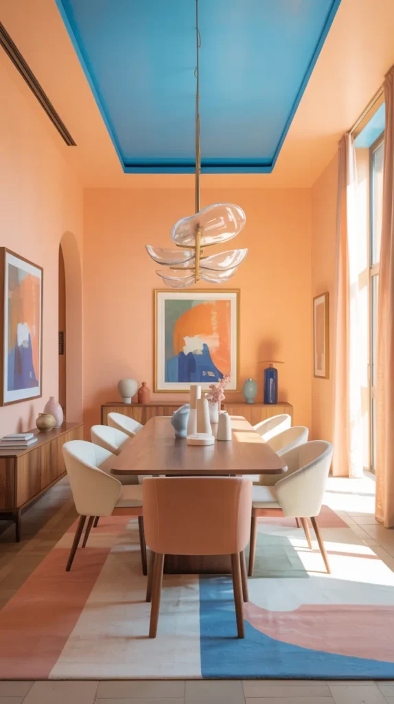
This combination plays with temperature in a subtle way. Peach walls wrap the room in warmth while a bright blue ceiling adds openness overhead, almost like sky above sunset. The contrast creates depth so the room feels larger than it actually is.
Because the strongest color sits overhead, furniture can remain balanced and the space won’t feel heavy. Natural light enhances both tones, making the palette shift throughout the day. The overall effect is calm yet vibrant, a space that changes mood depending on the time and lighting.
29. Mixed Pastel Palette Dining Room
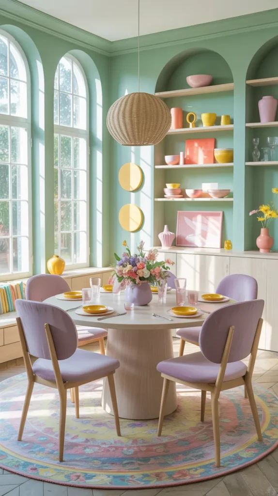
Instead of committing to one color, layer several soft hues together — mint, lilac, butter yellow, and soft coral. The trick is keeping them in the same brightness family so they blend instead of clash. The room feels airy but still full of personality, almost like color is diffused through the space.
Repeating each shade at least twice keeps the look organized. Chairs, artwork, and table decor quietly echo one another so the palette feels cohesive. The finished room feels lighthearted, welcoming, and carefully styled, proving multiple colors can still feel calm when balanced correctly.
20.Checkerboard Floor Color Dining Room
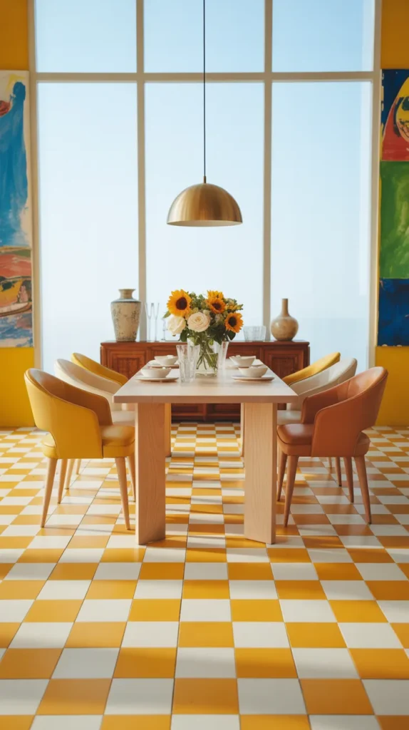
Instead of putting color only on walls or furniture, let the floor become the statement. A painted checkerboard in two bright shades — like butter yellow + white or sage + coral — grounds the entire space before you even notice the table. Because the pattern sits low, it energizes the room without overwhelming it.
Keep the furniture simple so the floor leads the design. A wooden table and soft upholstered chairs allow the pattern to feel intentional rather than busy. The room ends up feeling playful, classic, and unexpectedly elegant — almost café-inspired but still homey.