20 Black and White Kitchen Decor Ideas That Look Timeless
There’s a reason designers keep coming back to black and white kitchens — not because they’re safe, but because they’re powerful. When everything else trends in and out (sage cabinets, colored appliances, statement tiles), black and white stays relevant because it’s based on contrast instead of color.
A strong contrast palette instantly sharpens a space. Lines look cleaner, lighting feels brighter, and even basic cabinets appear custom. It forces every detail to work harder — hardware, lighting, wood tones, and texture suddenly matter more. That’s why some black and white kitchens feel flat… and others feel like they belong in a magazine.
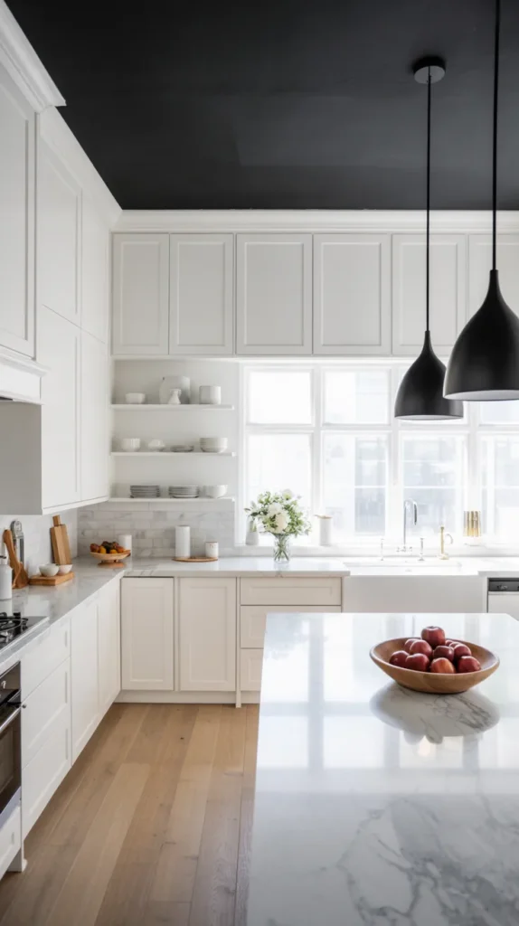
1. White Cabinets + Black Island Contrast
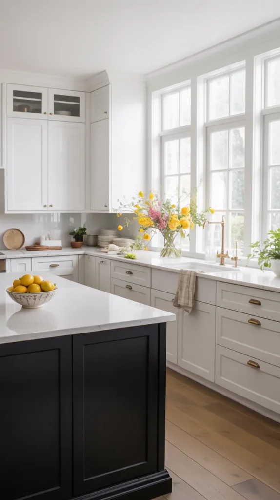
One of the fastest ways to make a kitchen feel intentionally designed instead of builder-grade is adding a visual anchor— and nothing anchors a room better than a black island. When everything is white, the eye keeps moving and the space can feel flat. But the moment you introduce a darker centerpiece, the layout suddenly makes sense. The island becomes the heart of the kitchen, giving direction to the seating, lighting, and workflow. Even simple shaker cabinets start to look custom because there’s now a focal point balancing the brightness.
To keep it from feeling harsh, layer in warmth and texture. Think wood stools, aged brass hardware, woven runners, or soft pendant lighting. The contrast should feel intentional, not stark. A good rule: the island should look like furniture, not cabinetry — decorative legs, panel detailing, or a slightly different countertop material all help. When done right, the kitchen reads cozy and elevated instead of clinical.
2.White Kitchen With Black Backsplash
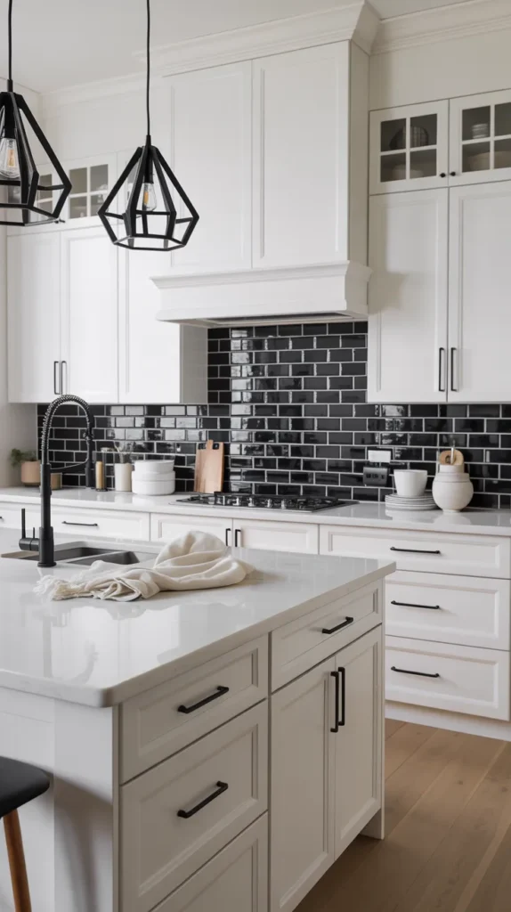
If you want contrast without committing to dark cabinetry, a black backsplash is the perfect middle ground. Against white cabinets, it creates instant depth and definition, outlining the working area so the kitchen feels structured rather than washed out. The eye naturally settles on the darker surface, which turns the cooking zone into a focal point instead of just a wall.
What makes this look successful is restraint. Keep the countertops light and the styling simple so the backsplash carries the visual weight. Matte tile feels modern, glossy tile reflects light for brightness, and stone adds quiet texture — but all achieve the same goal: grounding the room while keeping it airy. It’s a bold feature that still feels timeless because the rest of the palette stays clean and balanced.
3. Checkerboard Flooring Kitchen
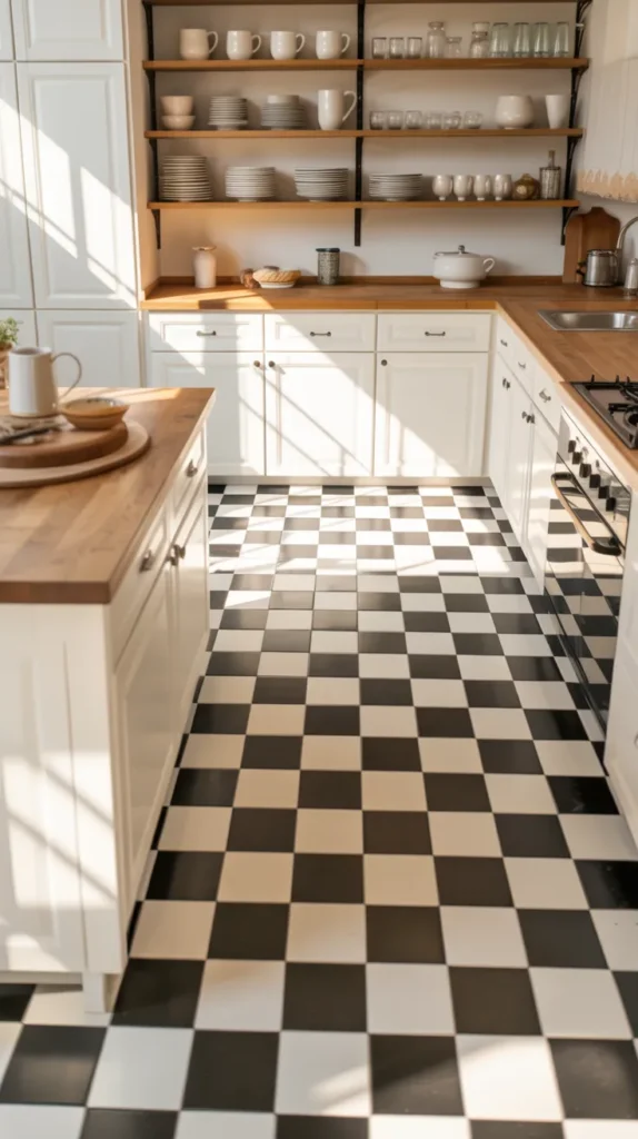
A black and white checkerboard floor instantly injects personality and history into a kitchen. It creates rhythm across the room, guiding your eye and making the layout feel intentional. Even plain cabinets look styled because the floor does the heavy lifting. Larger tiles feel modern and bold, while smaller tiles lean vintage — both work depending on the mood you want.
To keep it from looking retro diner, pair it with contemporary elements like sleek lighting or natural wood accents. The contrast grounds the space so you can keep everything else simple. This is one of the easiest ways to make a kitchen memorable without adding clutter — the design comes from the architecture itself rather than decoration.
4. Two-Tone Upper & Lower Cabinets
Two-tone cabinetry solves the biggest black-and-white dilemma: all white feels safe, all black feels heavy. Dark lowers provide stability and practicality — they hide scuffs, wear, and daily life. Light uppers keep the space airy and prevent the room from feeling boxed in. The eye naturally reads the space as layered, which makes ceilings appear taller.
This approach also gives flexibility. You can shift the mood depending on hardware and countertop choices — modern with matte black, warm with brass, classic with nickel. It’s one of the most livable designs because it balances aesthetics with everyday function. The kitchen feels designed but still comfortable enough to actually use.
5. Black Range Hood Feature Wall
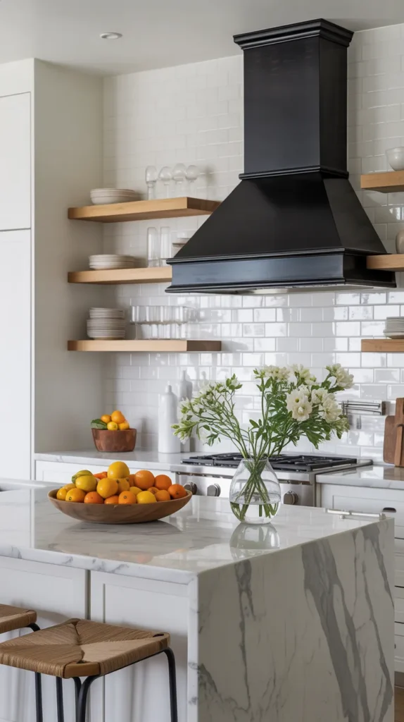
Instead of the backsplash being the focal point, a bold range hood creates a vertical statement that draws the eye upward. A plaster or painted black hood adds architectural presence, almost like a fireplace in the kitchen. It instantly upgrades the room because it introduces shape and depth rather than just surface decoration.
Pair it with simple tile so the hood remains the star. This approach works especially well in open-concept homes where the kitchen needs presence without clutter. The contrast frames the cooking area and makes the space feel intentional. It’s a surprisingly simple change that delivers a dramatic, designer-level result.
6. Matte Black Hardware Everywhere
Sometimes a kitchen doesn’t need a renovation — it just needs consistency. Swapping mismatched handles for matte black hardware instantly sharpens the entire room. The cabinetry suddenly looks intentional, the lines feel cleaner, and even older cabinets start reading modern. Because black acts like an outline, it visually defines doors and drawers, giving the kitchen quiet structure without adding clutter.
The trick is commitment. Mixing too many finishes weakens the effect, but repeating black across pulls, faucets, lighting, and even outlet covers creates a cohesive visual rhythm. Against white cabinetry, the contrast feels crisp and architectural; against darker cabinetry, it adds subtle depth instead of shine. It’s one of the lowest-cost changes that delivers a high-impact transformation.
7. White Kitchen With Black Window Frames

Black window frames function like picture frames for your kitchen — they create instant architecture even in a simple space. Without them, bright kitchens can feel washed out. With them, the room suddenly has boundaries and dimension. The eye naturally moves toward the light, and the window becomes a design feature instead of just an opening in the wall.
This works especially well in open layouts where you need gentle contrast without heaviness. Pair the frames with minimal decor so daylight stays the star. The kitchen still feels airy, but now it also feels intentional. It’s a perfect example of how a small detail can elevate a room from plain to magazine-worthy without changing the layout.
8. Black Open Shelving on White Tile
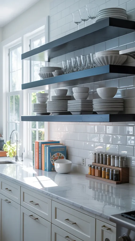
Open shelving often fails because it blends into the wall — but black shelves fix that instantly. They act as horizontal lines across the kitchen, adding structure while still keeping the room visually open. Against a white tile backsplash, they create a clean gallery effect where everyday items double as styling.
The key is editing. Too many objects make shelves look cluttered, but a thoughtful mix of dishes, bowls, and glassware turns them into functional decor. The contrast helps the eye rest, which actually makes the space feel calmer, not busier. It’s a practical solution that balances storage with style — especially in smaller kitchens.
9.Black Appliances in a White Kitchen
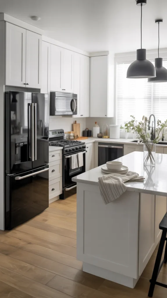
White kitchens can sometimes feel too soft or washed out. Introducing black appliances adds structure and definitionwithout changing the layout. They ground the space and connect small accents — hardware, lighting, and window frames — into one cohesive palette.
To make it feel intentional, repeat the color elsewhere in small ways. A black faucet or pendant lighting ties everything together so the appliances look integrated rather than inserted. The kitchen stays bright but gains contrast, making everyday elements part of the design rather than distractions.
10.Black Ceiling Kitchen
Painting the ceiling black sounds bold, but it actually makes the room feel more defined. Instead of the space fading upward, the ceiling becomes a visual boundary that frames the kitchen below. Lighting pops more dramatically and cabinetry looks sharper against it.
This technique works best in bright kitchens with good natural light. White walls and cabinetry prevent the space from feeling heavy, while the darker ceiling adds intimacy. The result feels architectural and memorable — a subtle twist that makes guests pause without immediately knowing why.
11. Black and White Accessories Styling
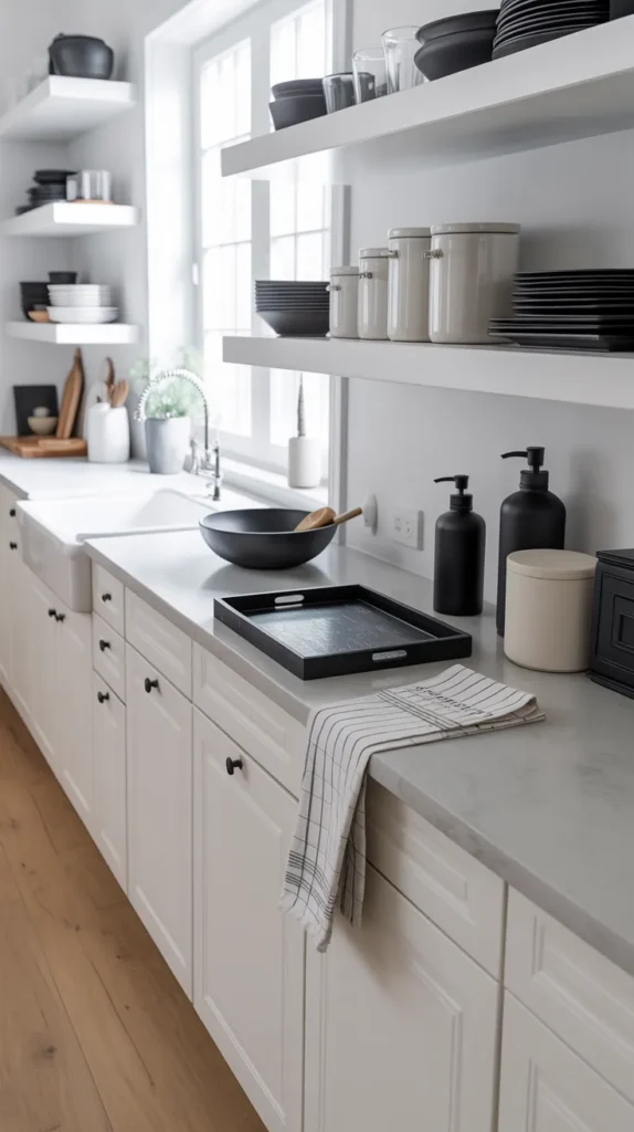
You don’t always need new cabinets to create a black and white kitchen — sometimes the transformation comes from the details. Swapping everyday items like utensil holders, trays, towels, and storage jars into a consistent monochrome palette instantly makes a kitchen feel styled. When everything follows the same visual language, the space looks intentional instead of accidental.
The secret is repetition. A black soap dispenser, striped towel, dark cutting board, and simple white ceramics work together to create a cohesive rhythm across the countertops. Instead of clutter, the eye sees order. Even open shelves feel curated because the accessories relate to one another. It’s one of the easiest ways to refresh a kitchen without renovation — styling becomes design.
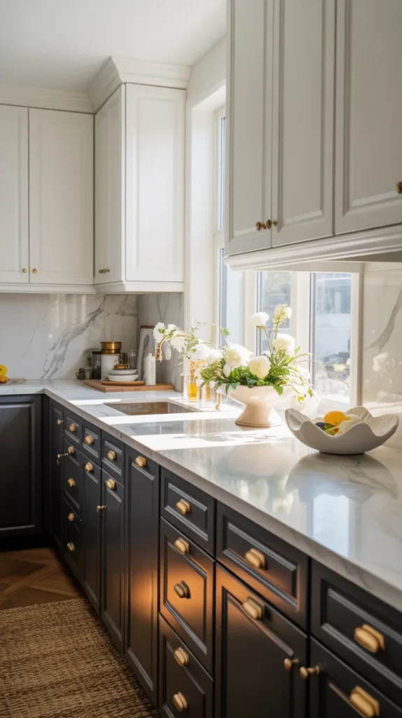
12.Black Cabinets + White Marble Counters
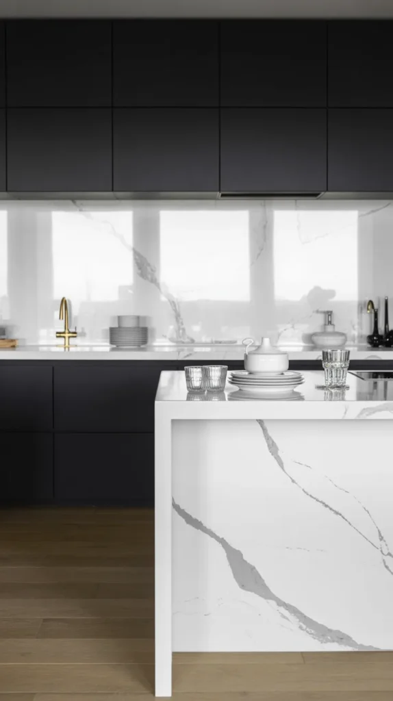
This combination works because it balances weight and brightness in a way few palettes can. Black cabinets ground the kitchen and give it presence — the room instantly feels intentional instead of temporary. Then the white marble lifts everything back up. The veining acts like natural artwork, adding movement so the space never looks flat or heavy.
To keep the look elevated, let the materials do the talking. Skip busy decor and keep countertops lightly styled so the stone remains the focal point. Simple lighting and minimal finishes allow the contrast to feel calm rather than dramatic. When done right, the kitchen reads luxurious but effortless, relying on surface quality instead of decoration.
13.Chalkboard-Style Backsplash Wall
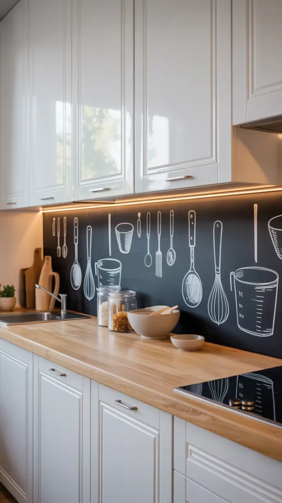
A chalkboard backsplash instantly turns a kitchen into a living, interactive space rather than a purely decorative one. Instead of static tile, the wall becomes changeable — recipes, notes, menus, or simple sketches can evolve with daily life. The dark surface adds strong contrast against light cabinetry, creating structure while still feeling playful and creative.
What makes this idea work is balance. Keep cabinets clean and surfaces simple so the drawings remain the focal point instead of visual noise. The chalk art acts like rotating artwork, giving personality without permanent commitment. It’s especially effective in family kitchens or casual homes where design and function blend together naturally.
14.Black Frame Glass Cabinet Doors
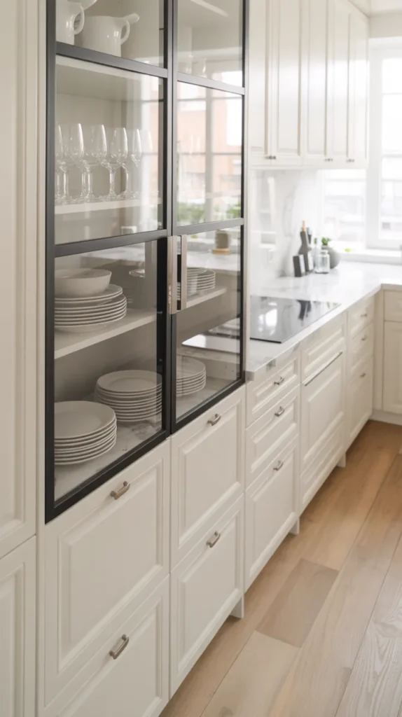
Black frame glass cabinets add instant structure to a kitchen without making it feel heavy. The thin dark lines act like outlines around the room, turning everyday storage into a display feature. Instead of cabinets blending into the wall, they become architectural details that give the space rhythm and depth.
To keep them from feeling busy, edit what you display. Stacked white dishes, simple glassware, and a few neutral pieces create a gallery-like effect rather than clutter. Because the frames already provide contrast, the styling can stay minimal — the cabinets themselves do most of the design work while still keeping the kitchen bright.
15.Monochrome Striped Runner Rug
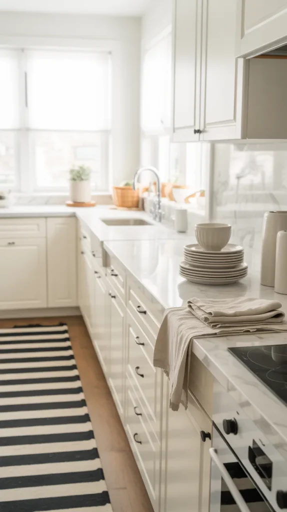
A striped runner is one of the simplest ways to soften a black and white kitchen. Hard surfaces dominate kitchens — cabinets, counters, tile — so adding a textile introduces movement and comfort without breaking the palette. The stripes guide the eye through the room and make narrow layouts feel longer.
Choose a low-pile washable rug so it feels practical rather than decorative. Because the pattern already adds interest, the rest of the styling can remain clean. The kitchen keeps its crisp contrast but gains warmth, turning a sharp space into one that feels welcoming and lived-in.
16.Black and White Wall Art
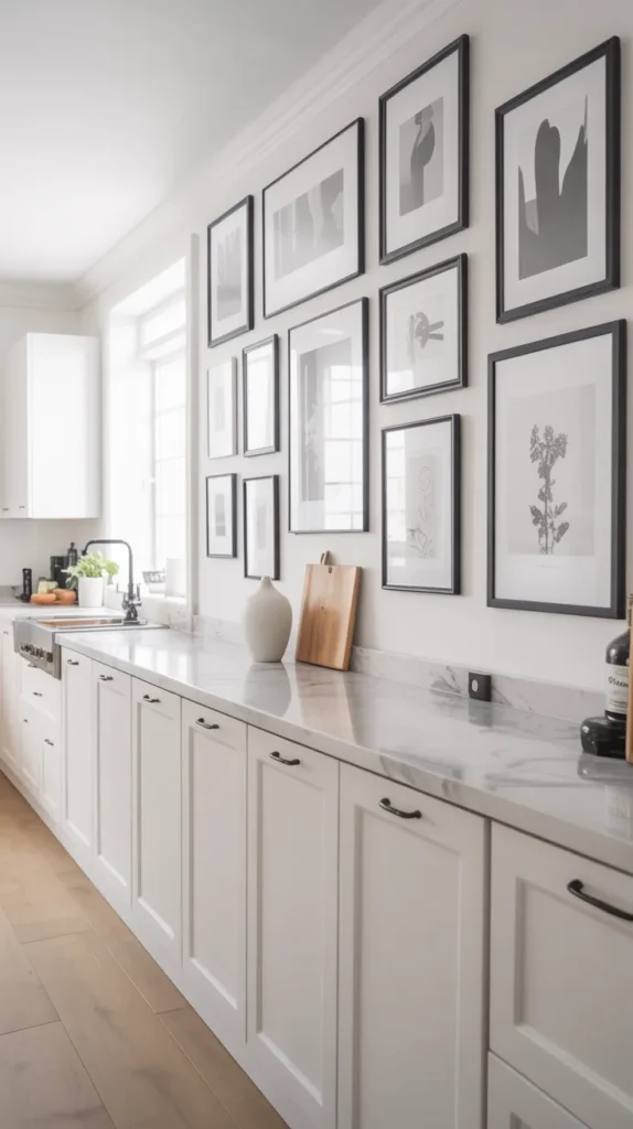
Wall art is often overlooked in kitchens, but it’s one of the easiest ways to make the space feel finished. A black and white palette works especially well because it adds personality without visual clutter. Instead of introducing new colors, artwork reinforces the existing contrast while making blank walls feel intentional rather than empty.
Choose simple prints — sketches, typography, food illustrations, or architectural drawings — and keep the frames consistent. A small gallery near a dining nook or coffee area creates a focal point without overwhelming the room. The result feels styled and curated, turning the kitchen into a space people want to linger in, not just cook in.
17.Striped Bar Stool Designs
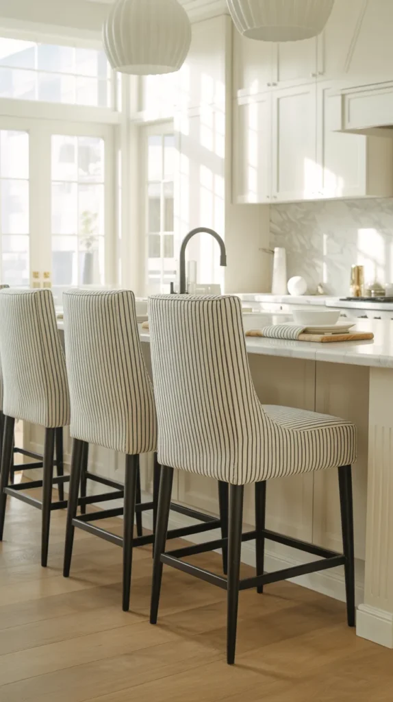
Striped bar stools are a simple way to introduce pattern while keeping a black and white kitchen cohesive. Because the palette is already high contrast, stripes feel intentional rather than busy. They draw attention to the seating area and help the island read like a designed gathering space, not just a workspace. Even in minimal kitchens, the pattern adds movement and prevents the room from feeling flat.
Vertical stripes feel taller and more tailored, while wider or relaxed stripes lean casual and inviting. The key is repetition — echo the black accents in lighting or hardware so the stools look integrated, not random. With the right scale, striped upholstery softens hard surfaces and adds warmth without breaking the monochrome aesthetic.
18.Black French Pantry Doors
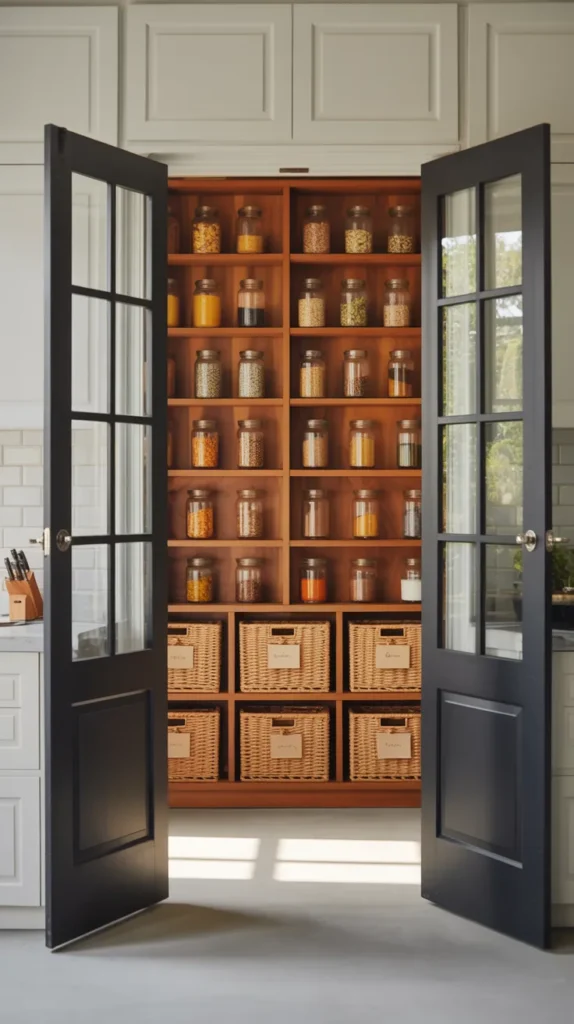
Black French pantry doors create a focal point without overwhelming the room. The divided glass panels add pattern and depth, while the dark frames anchor the surrounding white cabinetry. Instead of blending in, the pantry becomes an intentional feature that adds architectural character to the kitchen.
Because the doors already provide detail, the rest of the space can stay simple. The glass softens the contrast and keeps the room feeling open rather than closed off. It’s a bold element that still feels timeless and refined.
19.Stylish Black and White Tile Flooring
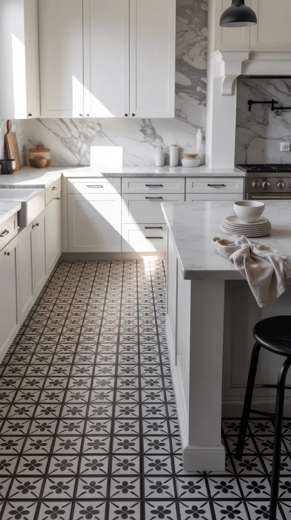
Flooring is one of the most powerful ways to add personality to a black and white kitchen because it anchors the entire room. While cabinets and counters stay calm, a patterned floor introduces movement and structure that guides the eye through the space. It makes even simple cabinetry feel intentional, turning the kitchen from plain into designed without adding clutter.
The key is balance. Let the floor carry the visual interest and keep everything else restrained — clean cabinets, simple surfaces, and minimal decor. Larger patterns feel bold and modern, while smaller patterns feel classic and detailed. Either way, the monochrome palette keeps the look timeless while the pattern adds character and depth.
20.Glossy Lacquer Cabinet Finishes
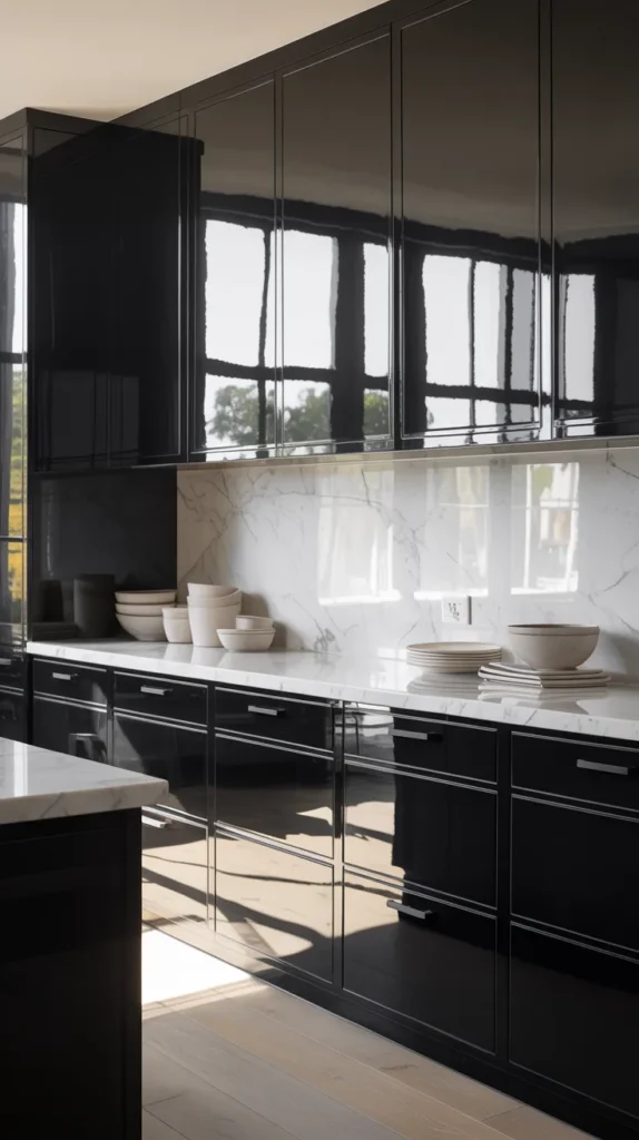
Glossy lacquer cabinets instantly change the mood of a black and white kitchen. Instead of absorbing light like matte finishes, they reflect it — making the entire space feel brighter and more polished. The smooth surface creates clean uninterrupted lines, which works especially well in modern kitchens where simplicity is the design focus.
Because the finish already has presence, styling should stay minimal. Too many textures compete with the shine, but simple counters and subtle hardware let the cabinetry act like architecture. The reflection also helps smaller kitchens feel larger, bouncing daylight around the room and softening the contrast between black and white surfaces.