The Best Summer Color Combo to Make Your Home Look Designer (Hint: It’s Not Beige!)
Okay, let’s be real—beige had a moment. It was safe, it was clean, it was giving “Pinterest minimalist in 2018.” But now? It’s kind of… beige. As in, flat. Blah. The color equivalent of a polite nod. If you’re craving a home that screams designer summer glow-up, I’m here to drop the ultimate truth bomb:
The best summer color combo isn’t beige—it’s olive green + terracotta.
Yep. Earthy, rich, grounded—but still warm, chic, and surprisingly versatile. And I swear, once I swapped out my beige-everything with these two tones? My whole apartment went from “she tried” to “who styled this?!” 😎
Let’s get into the why, the how, and the please tell me where you got that cushion.
Why Olive + Terracotta Is The Summer Power Couple
Ever wonder why some spaces just feel expensive—even when you secretly know that rug came from Amazon and not Italy? It’s all about color psychology and pairing tones that whisper (not shout) luxury.
Olive = Calm + Classy
This color does things beige wishes it could do.
- Grounds the space without looking dull
- Pairs beautifully with woods, whites, blacks, and yes—even brass
- Feels organic and earthy (like, you live next to a vineyard or something)
Terracotta = Warm + Lively
Terracotta’s not just for clay pots anymore. It gives your space that effortless Mediterranean meets modern energy.
- Adds warmth without being too loud
- Makes any white wall feel curated
- Instantly gives “designer touch” when used in textiles or ceramics
Put them together? You get a perfectly balanced vibe—cool and collected meets warm and worldly. IMO, it’s giving Architectural Digest on a Target budget. 🙃
Where This Combo Works Best (AKA: Steal These Ideas)
Let’s talk placement. You don’t have to repaint your whole house (unless you want to—power to you). Just swap a few key items and bam—instant glow-up.
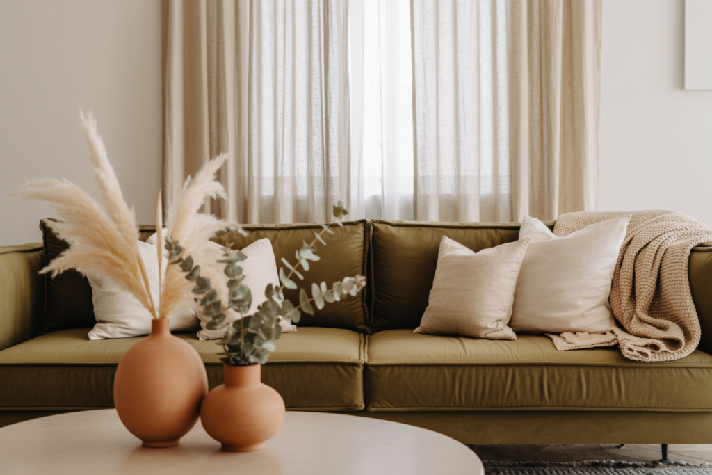
Living Room Vibes

This is where I started. And no joke, my guests legit asked if I hired a designer.
Try this:
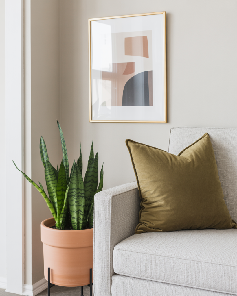
- Olive velvet pillows on a neutral couch
- Terracotta ceramic vase with dried florals (or eucalyptus if you’re feeling
extra) - A jute rug to ground it all (texture matters!)
Ever thought a throw pillow could change your life? Same—until I got one in burnt terracotta and my beige sofa stopped crying itself to sleep at night.
Bedroom Warm-Up

I used to do all-white bedding. You know, “hotel vibes.” But you know what that turned into? Laundry anxiety. Now? I’m team tone-on-tone.
Here’s what works:
- Olive green linen duvet (wrinkled on purpose = chic)
- Terracotta or rust-colored throw at the foot
- Rattan bedside lamp for that sundrenched look
FYI: Adding color to a bedroom doesn’t mean chaos—it means character.
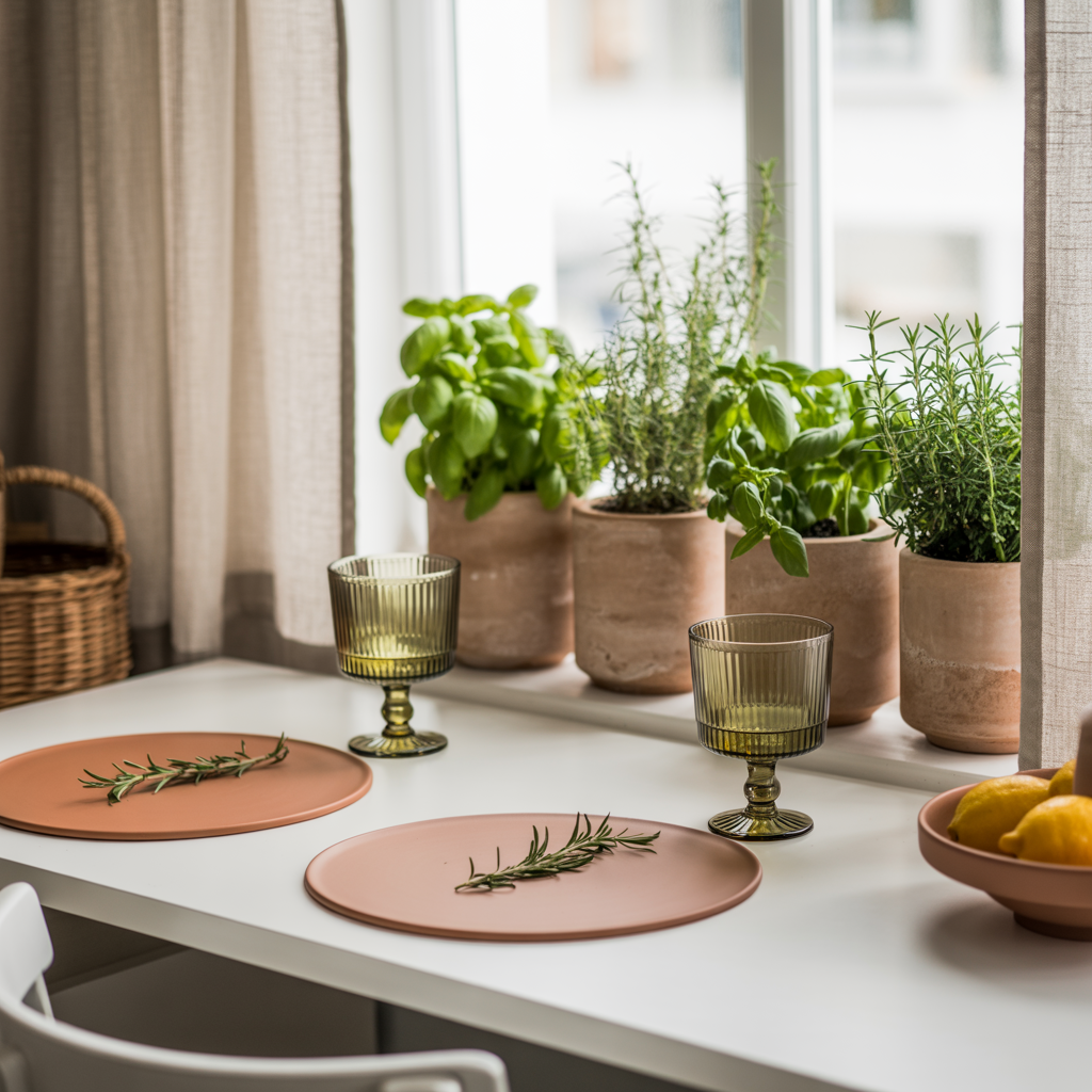
Kitchen & Dining: Subtle Pops, Big Impact
No, you don’t need to redo your cabinets. Just sprinkle some olive + terracotta magic around.
Try:
- Terracotta-colored napkins or placemats
- Olive-toned glassware (yes, it exists and yes, it’s gorgeous)
- Herb pots in clay planters—bonus points if they’re actually alive 😅
Designer Tricks to Pull It All Together
I went down a Pinterest rabbit hole (as one does), and here’s what I learned from the big-league stylists:
1. Stick to Earthy Neutrals as the Base
Use white, cream, or light wood as your canvas. Then layer olive and terracotta like accessories.
Why? Because too much of either can tip the room into “Tuscan restaurant” territory. We want tasteful, not theme party.
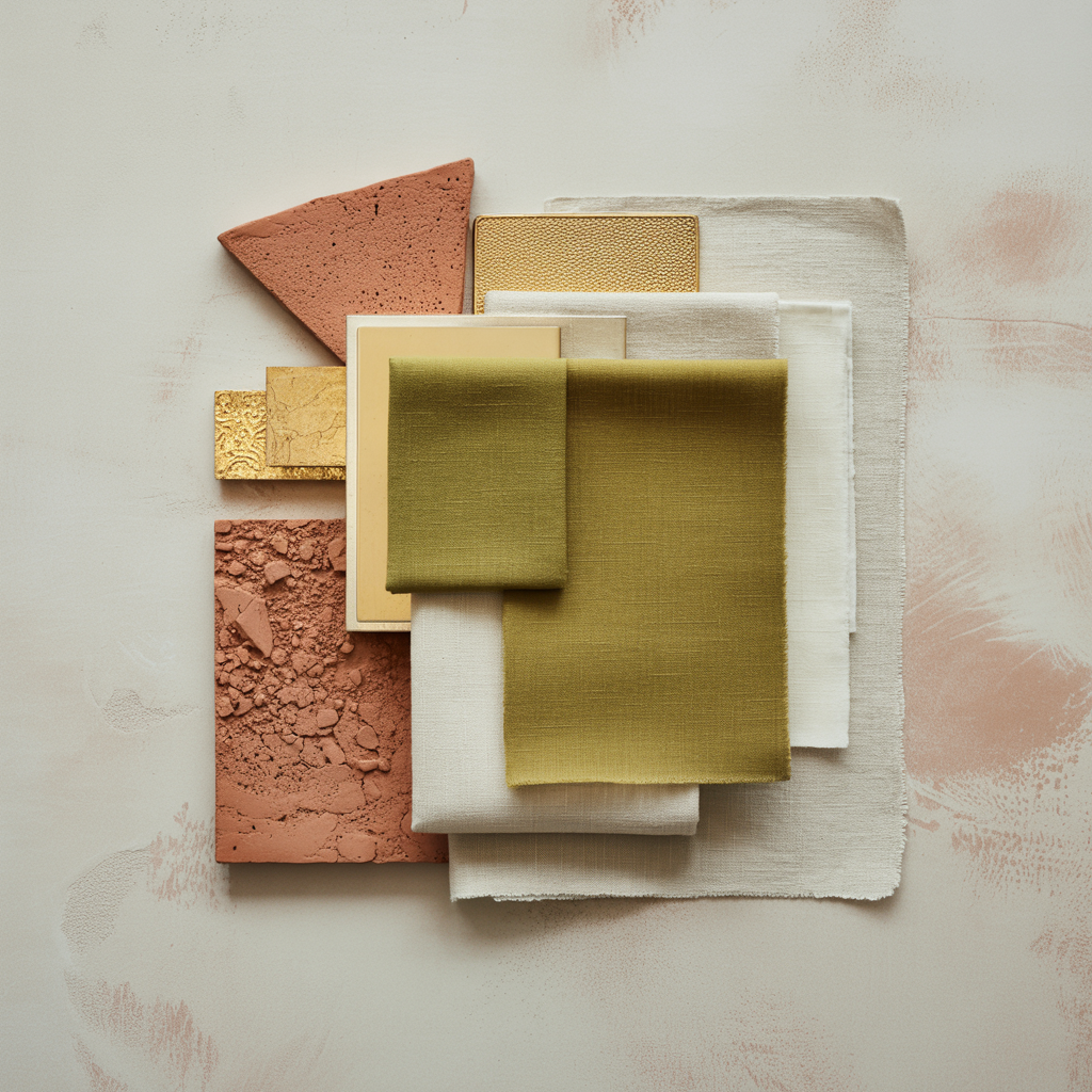
2. Mix Textures, Not Just Colors

This one’s a game-changer. Even if you’re using the exact same two colors, texture adds depth.
- Olive in velvet = luxury
- Olive in linen = relaxed vacation
- Terracotta in matte pottery = rustic
- Terracotta in glossy tile = modern
See what I mean? Same shades, totally different vibes.
3. Go Big in One Zone, Then Echo Elsewhere
Designers call it color anchoring (I call it “color copy-pasting with style”).
Let’s say your biggest olive piece is your duvet. Pull that tone into your nightstand styling, maybe with a ceramic dish or framed artwork.
It’s like outfit matching—but for your home. Intentionality is the secret sauce.
Budget-Friendly Ways to Try It (No Reno Required)
Don’t worry, I’m not gonna tell you to spend $400 on “artisanal pillow covers.” Unless you want to, of course. 😉
Here are some easy-entry options:
$ — The “I Just Want a Taste” Tier
- Throw pillow covers from Amazon or H&M Home
- Mini planters in terracotta (check your local plant shop)
- Olive-toned candle holders or trays
$$ — Midrange Glow-Up
- Linen curtains in a muted olive
- Ceramic table lamp in rust or clay
- Bedding upgrades or a chunky throw
$$$ — Treat Yourself
- Accent chair in olive (velvet? Yes please)
- Area rug with terracotta accents
- Large-scale art with abstract olive + rust tones
Pro tip: Etsy has so many olive + terracotta digital downloads. Print at Staples = instant budget wall art.
Bonus Combos: Who Plays Nice with Olive + Terracotta?
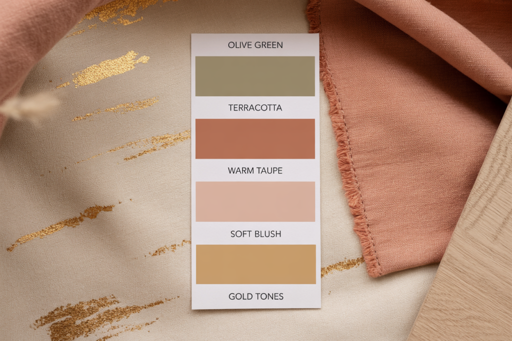
This duo’s powerful, but it also plays well with others. If you’re into layering more colors, here’s what works:
- Brass or gold accents – elevate everything, instantly
- Soft blush or dusty rose – adds romance, avoids clash
- Warm taupe or oatmeal – a modern alternative to beige
- Charcoal or matte black – for a bold, modern edge
Just promise me one thing: don’t pair it with cool blue. It’ll feel like a weird Mediterranean vs. Coastal grandma showdown. 🙃
Final Thoughts: It’s Time to Break Up with Beige (Gently)
Look, beige isn’t evil. It’s just… safe. And this summer? We’re ditching safe. We’re leaning into stylish warmth and bold elegance.
Olive and terracotta bring your space to life in a way no grayscale neutral can. They say “I know what I’m doing,” even if you were literally just winging it with some HomeGoods finds and a Pinterest board titled “dream apartment ✨.”
So next time you’re eyeing that beige throw or ivory pillow set… just ask yourself: What would olive and terracotta do?
(They’d upgrade it. That’s what.)
Your Turn: Ready to Try It?
If you give this color combo a whirl, tag me or drop a pic—I seriously want to see how you bring it to life. Whether it’s one terracotta vase or a full-on olive couch moment, you’re officially entering your designer summer era. And trust me, your home will thank you.
Happy styling! 💚🧡